Photo Corners headlinesarchivemikepasini.com
![]()
A S C R A P B O O K O F S O L U T I O N S F O R T H E P H O T O G R A P H E R
![]()
Reviews of photography products that enhance the enjoyment of taking pictures. Published frequently but irregularly.
Printing On Ilford Galerie Prestige Fine Art Papers


12 April 2013
Last Friday we published an image from a set we took at Warm Water Cove on a rainy day in San Francisco. We liked it enough to crank up the Epson R3000 for a 13x19 print on a new sheet from Ilford.
We promised to let you know how it printed. And here's our report.
THE PRESTIGE LINE | Back to Contents
Ilford had sent us a sample pack of its newest line of its Galerie Prestige fine art papers. These are 13x19 heavy sheets that don't go through your Average Inkjet Printer. But printers like the Canon Pro series and larger Epson Stylus series are built for them.
The sample pack contained four kinds of 13x19 paper:
Gold Cotton Textured: A mold-made, 100 percent cotton rag paper made with no optical brighteners, 330gsm. $96 for 10 sheets.
Gold Cotton Smooth: A mold-made, 100 percent cotton rag paper made with no optical brighteners, 330gsm. $96 for 25 sheets.
Fine Art Textured: Bright white, double-sided, mold-made alpha-cellulose sheet, 220 gsm. $77 for 10 sheets.
Fine Art Smooth: Bright white, double-sided, mold-made alpha-cellulose sheet, 220 gsm. $53 for 10 sheets.
There's also a Gold Mono Silk, which we didn't try. Pricing information is from (at)lex.
Alpha cellulose is a highly refined, insoluble cellulose made from a variety of plant sources. But the usual sugars, pectin and other soluble materials have been removed. Because paper permanence improves when non-cellulosic impurities are eliminated, alpha cellulose rivals cotton as a stable and permanent sheet.
The four sheets in this set differ in just two aspects. The first is the sheet color. The Gold Cotton sheets are a warm yellow-white while the Fine Art sheets are blue-white. And the second is the texture, either smooth or textured much like a watercolor sheet.
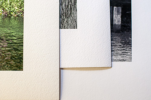
Prestigious Options. Gold Cotton Textured, Fine Art Textured, Fine Art Smooth, lit from a low side angle to show texture. Note the slight curl.
They are all porous, designed for pigment printers. You can print them on a dye printer like the Canon Pro-100 but you won't get the same longevity.
Ilford supplies ICC printer profiles for each of these sheets and inksets for Canon, Epson, Kodak, HP and Lexmark printers, although not all profiles are available for all printers.
Always start your paper shopping with a search for an ICC profile of that paper for your printer's ink. The paper manufacturer's site is the place to look.
We found a set for the Epson R3000 and took another look at our image.
ADJUSTMENTS | Back to Contents
It had been raining so the sky was overcast and the image didn't have a lot of contrast. Getting the tones just right took a while. In fact, we weren't convinced we'd gotten it right on Friday.
So we reopened the original Raw file in Adobe Camera Raw and took it from the top, using the Grayscale conversion and the Red and Blue sliders to get things in shape.
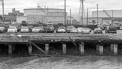
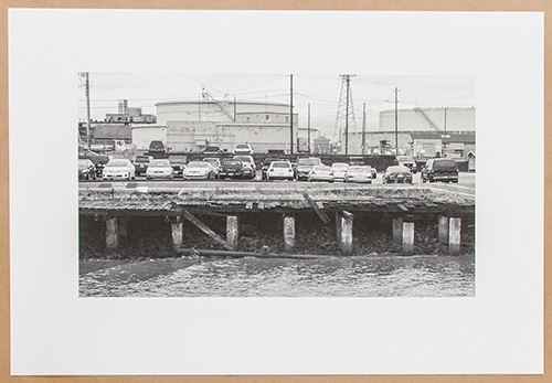
The Lot. Layers of civilization.
We wanted to preserve the horizontal layers in the image: the sheen of the water, the rocks under the pilings, the broken dock, the uneven pavement leading to the public shore, the rows of vehicles, the distant buildings and the sky. It was almost an archeological tel.
But an amusing one. The cars and trucks look a bit bewildered. And by enhancing their contrast, the image became more interesting. We just didn't want to lose the rocks. In fact, we had to bring them out. Although we suspect they were an anti-erosion measure added later. And we also wanted to bring out the sky a bit more, too.
When we finally got the look we wanted, it was time to pick a paper.
SMOOTH | Back to Contents
We took this shot in a harness suspended from a small traffic helicopter, hence the waves on the bay water.
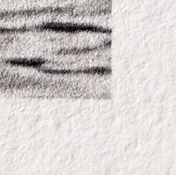
Fine Art Smooth. Holdout is excellent, delivering crisp detail and solid blacks, as this macro shot of the black-and-white print shows.
Just kidding.
It's actually a long shot using a 200mm focal length. Even at that only about two-thirds of the image remains in this crop. So what detail remains is very important.
So we ruled out both of the textured sheets, which would have obscured the detail a bit. The question become which smooth sheet (which would preserve the detail) to use.
We opted for the cool rather than the warm sheet because it was a cold day with gray skies. A warm sheet would have given the wrong impression.
The only question left was why use an uncoated sheet rather than a glossy sheet? And again, the subject is the answer. Gray, misty weather doesn't want a lot of contrast. There's nothing bright in the image.
So we decided to print on the Fine Art Smooth sheet.
DECODING ILFORD PROFILE NAMES | Back to Contents
The hardest part of the job is finding the right profile in the list of ICC profiles when you print with your application and not the printer managing color. An approach, by the way, which gives you more control.
Ilford makes this more difficult than it has to be, particularly if you are an infrequent printer and forget the clues.
Here's a typical profile name: MOAB Slickrock Metallic Pearl Epson R3000 UPPL.icc. It's pretty clear what sheet that works for on which printer. It's the profile for Moab's Slickrock Metallic Pearl on an Epson R3000, just like it says.
Now here's an Ilford profile name: n_GPFAS_EPSr3000_USFAPn.icc. Time to put on your decoder ring and play along.
- n_ is a prefix indicating this is an Ilford profile. They're all together in the list of profiles.
- GPFAS_ is the "media code" indicating the sheet (here it stands for Galerie Prestige Fine Art Smooth. Yep, it's just the acronym.
- EPSr3000_ is the "printer code" for the Epson Stylus R3000.
- USFAP is the "printer driver media type" or the paper type you should use with the driver. Here is indicatesUltra Smooth Fine Art Paper.
- n is the "color management" required, with "n" meaning "none."
In the PDF that accompanies each ICC profile you download from the Epson side, Appendix A contains all these codes so you don't have to remember what WPRW means (um, Watercolor Paper/Radiant White).
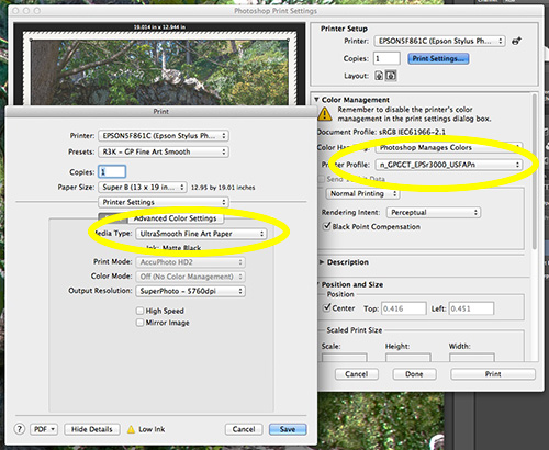
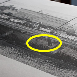
Driver Settings. The two important ones are circled in yellow: Photoshop's Color Management (back) and the Printer Setup's Media Type (front).
Wish we could tell you that renaming the profile was all you had to do, but the internal name is used, not the filename, so we remain at Ilford's mercy.
PRINTING | Back to Contents
At 220gsm, we felt the paper would do best in the manual feed. So we opened the back door, dropped the gray table in front and slid the sheet in, lining it up on the marks manually and nestling it along the side guide with both hands, one at the head of the sheet, the other at the tail.
The printer loaded the sheet into printing position when we tapped the OK button.
We were careful with the sheet but we noticed it creased easily. Although once mounted, that shouldn't be a problem.
The Lot Print. A photo of the actual print laying on shipping paper.
On the computer, we pulled up the print dialog box, set the ICC profile and made sure the driver yielded to it. We also set the page size and placed the image on the sheet so the top margin was a bit less than the bottom margin.
Ilford recommends setting the Media Type to Ultra Smooth Fine Art Paper, Print Quality to Maximum Quality and Mode to Adobe RGB. So we did that.
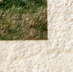
Absorption. Heavy coverage (compare circled area to The Lot Print above) was not absorbed into the sheet. In fact, it covers so well it reflects light at this angle. Nice work by the paper and Epson's matte black.
That's really all we had to do.
Printed only with the Epson UltraChrome K3 gray inks, the sheet came out saturated with ink. We let it dry for a while before handling it and evaluating it.
However much ink the R3000 laid down, the sheet was able to absorb it. And without showing through on the other side. It truly lived up to its boast of double-sided printing.
And whether it was the ink formulation (it is, to a large extent) or the paper surface, the dark detail held up without flooding. And the highlight detail was nicely rendered as well. You could look at the thing with a loupe and still see more detail.
We particularly liked the brightness of the sheet with the neutral gray of the K3 inkset. They're really made for each other.
So, if you can't tell already, let us tell you we were quite pleased with the quality of the print. We'd go so far as to say we preferred it to the image we had on screen.
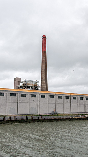
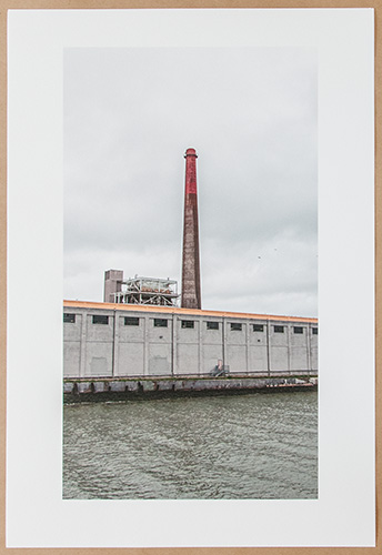
Cove Obelisk. We accentuated the red and yellow. And left all the birds in the image.
COLOR | Back to Contents
Printing black and white is a thrill -- if you have a rich monotone image. But printing color is a different problem.
Problem? We meant to say challenge. And our experiments with Richard Benson's intriguing method of printing in layers are nearly ready for publication. But meanwhile, we tested this sheet by printing the way everybody else does: in one pass.
Our Warm Water Cove images included a deceptive one. Following Frank Clarke's composition reminder to Have Some More Fun (Horizon, Sky, Middleground, Foreground) we'd have to describe this vertical image as a bright but overcast sky, with no horizon but a factory building about a third up the image in the middleground and the bay in the foreground.
We did crop it as a 16:9 but we didn't use Smart Sharpen this time. Instead we relied on Nik Sharpener to do the deed. It's smart about not sharpening flat areas like sky while working over textures like the concrete building.
We thought it might make another nice black-and-white but three things cried out color to us as we worked on it. The tip of the tall smokestack, which is the real subject of the image, is painted red. There's an industrial yellow strip painted along the top of the building. And inside the dark windows there are factory lights which might not print convincingly in just black-and-white.
Gold Cotton Textured. Macro shot.
So color it would be. But which printing surface?
With the rough texture of the building and the choppy bay water, we opted for the Fine Art Texture sheet. Intriguingly enough, you use the Ultra Smooth Fine Art setting for that, too.
It's a 220gsm sheet like the Smooth version but it felt a little stiffer to us. And when we pushed it into the R3000 from the from feed table, it wouldn't go all the way through. It kept snagging on something.
The problem was paper curl. There's a very slight curl to the end of the sheet (which did not affect printing) that made it slip down instead of through the paper path in the printer. So we decurled it.
Cove Obelisk Print. Not an equivalent of the screen image so much as it's own rendering.
Ah, how to decurl paper. Take the palm of your hand and slide it under one of the curled corners. Then roll your hand over gently so the paper forms a large curve in the opposite direction. Roll that curve back and forth a bit -- gently, gently. The paper will lie flat when you release it.
When the print came out of the printer, it was just gorgeous. In fact, we might just recommend framing the blank sheets of paper themselves. They hardly need an image to shine. But our smokestack looked regal and the unexpected red and yellow in the image drew us in like, well, a Richard Benson print.
GOLD SHEETS | Back to Contents
The only other factor among these sheets is the warmer toned Gold series. But to try that we had to leave our Warm Water Cove images for something that was a warm image to begin with.
Portraits are the best candidates but we wanted something of a more universal appeal (we have a reason). So we took a look at some photos we shot at Stow Lake one sunny day.

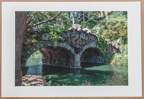
Stow Lake Bridge. A highlight mask saved the right half of the image.
We settled on a stone bridge built in 1893 that spans a narrow part of the lake. There's some foliage on the other side in sunlight but the shot was taken on the shady side of the bridge. Light reflects various colors off the water, complimenting the vari-colored stones in the old bridge.
We left it at full frame but used Smart Sharpen this time. We also tinkered with the tonality quite a bit, brightening up the shadows and toning down the highlights with a highlight mask.
Print. Excellent detail and strong dark tones.
Settings were nearly identical to the Fine Art Textured for this sheet. Really the only difference is the warmer tone. That served our stone and foliage well. And the 330gsm sheet, noticeable stiffer than the other textured sheet, held the heavy inking for this dark image quite well.
The Gold Cotton Smooth sheet is also 330gsm, oddly enough. Why both warm sheets are heavier than their Fine Arts cousins is a mystery. Perhaps it's the cotton content.
SUBSCRIBER BONUS | Back to Contents
These are just lovely images that we hate to box them up as the test samples. And we don't really want to get into the print sales business (what with sales tax and all that). So here's a thought.
If you're a subscriber to Photo Corners (we know who you are), let us know which one you'd like. We've set a form to make it easy.
Then we'll hold a drawing for each image in a week or two and the winner will get the signed 13x19 print with a certificate of authenticity rolled up in a triangular mailing tube as a thank-you gift.
CONCLUSION | Back to Contents
Let's not beat around the bush. All of these sheets rate four out of four photo corners. They were a delight to work with and we were only half kidding when we said they could be framed unprinted and still bring appreciative nods.
But when you print on them, their true beauty blossoms.
We worried if our fine detail (like the license plates on the parked cars) would disappear into the porous surface of the bright sheet. We worried if our blacks would sink into a dull gray. We worried if the subtleties of a gray sky would be sponged up. We worried if so much black would show through on the double-sided sheet. We worried if the color inks we were laying down so heavily would turn into mud. We worried for nothing.
As each image came out of the printer, we were -- simply -- delighted beyond our most informed expectations. And not just us, but visitors to the bunker came back to have another look at them. "Artistic!," said one. "Beautiful!" cried another. There was just something magnetic about the images on that paper.
These weren't just printed images. They were prints. They achieved their best expression as ink on paper, not as a saturated display of pixels on a monitor. They brought back both the joy of printing and its possibilities.
Which is what it's all about.