Photo Corners headlinesarchivemikepasini.com
![]()
A S C R A P B O O K O F S O L U T I O N S F O R T H E P H O T O G R A P H E R
![]()
Enhancing the enjoyment of taking pictures with news that matters, features that entertain and images that delight. Published frequently.
A Storehouse Test Drive


17 January 2014
When Storehouse launched earlier this week, we were anxious to give the free service a try. Imagine being able to assemble a story for the Web using text, stills and video without wrangling all the code.
As Business Insider CEO Henry Blodget told Charlie Rose this week, publishing on the Web is publishing without restrictions. If you need video, you put up video. If you need stills, you put up stills. If it's short, put up a short piece. There's room for a long one, too.
But it isn't easy to do that.
We've managed to present slide shows, video, stills and text here as the story required but we write our own code. And even then, we keep the layout pretty simple. There are no montages of stills, for example.
We'd love to be able to present a story the way the N.Y. Times presented Snow Fall. And we suspect you might too.
ENTER STOREHOUSE | Back to Contents
Storehouse bills itself as "the easiest way to create, share, and discover beautiful stories." A story at Storehouse is a single scrolling page that contains text, stills or video attractively arranged for the viewer.
It's also a hosting service where you can view these stories and even follow authors that interest you.
As Storehouse CEO Mark Kawano notes in his blog:
Images have become the universal language of the mobile age. We built Storehouse so that anyone can seamlessly combine photos and videos to tell a meaningful story. While the emphasis is on visual content, it's also easy to provide context with text. Storehouse is not just about sharing photos, it's about telling stories through your images -- still or moving.
It's free at the moment to both author and view but the real attraction is how easy it is to lay out a sophisticated presentation. Not quite Snow Fall perhaps, but closer than you get with Flickr or Revel.
Easy, that is, if you have an iPad. The authoring app is iOS only.
THE APP | Back to Contents
When you first launch the app, a short tutorial explains how to do things at Storehouse. Swipe, scroll, pinch to exit a production, etc. It's an elegantly simple interface but some things you just need to be told.
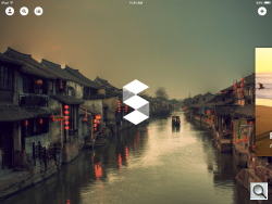
Storehouse App. Main Screen.
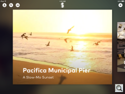
Storehouse App. A presentation.
After the tutorial, you enter the program itself and are presented with the Storehouse logo over a background image with the hint of a presentation to the right (swipe to watch it and others) and a row of icons on top. Three on the right include:
- Your Account. You can see who's following you, how many stories you've posted, how many have recommendations they've gotten, drafts, how many drafts you have. From the Settings option, you can edit your full name, email address, add a bio, set an avatar and select a cover image.
- Search. You can search for people by name or just scroll through a list of authors.
- Activity. Our screen just reported no activity yet.
In the right-hand corner, a plus icon lets you Create a Story.
CREATING A STORY | Back to Contents
You can add up to 50 photos and video (30 seconds or less each) to each story. Four sources are listed on the left: iPad Photo Library, Dropbox, Flickr and Instagram.
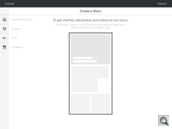
Create a Story. Four sources.
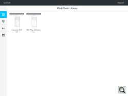
Stills. Camera Roll or Photo Stream.
We selected our iPad Photo Library, which let us choose between our Camera Roll and My Photo Stream.
With our Camera Roll images arrayed across the screen, we simply tapped the ones we wanted to use in the story. A radio button at the top lets you Select All, but we had several hundred, so that wasn't going to work.
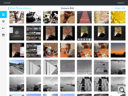
Camera Roll. Tap to select.
Draft. First image selected.
When we had tapped an image, the Import button at the very top became active and an image count appeared to its left. Seven seemed like a good number to start.
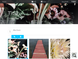
A progress bar keeps you updated on the import process, which was pretty quick for our seven shots. You're then presented with a story layout that features a full width background image using your first selection with placeholders for a Title and Subtitle.
Your byline appears below that and then your images are laid out as square crops, three across in as many rows as it takes.
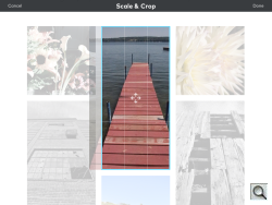
Scale & Crop. Smart default crop.
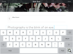
Edit Text. Three styles.
The top of the screen has all the commands you need: Cancel, Text, Media, Save Draft and Publish. Text inserts a text box in the layout. Media took us back to our Camera Roll.
But a blue outline on our first image in the first row hinted we could get to work on the layout of our story right away. A Crop tool and a Trash tool were just above the image. The outline had three handles to change the shape and size of the image as well.
Pretty simple, right?
Tap the Crop tool and you can see the current crop as well as the rest of the image while the layout is dimmed. Pinch or zoom to change the magnification. Drag the image around to change the crop.
We didn't see a way to rotate the images (the usual gesture did nothing).
And while we had trouble doing it at first, you can change the order of the images by dragging them around. Moving one can juggle all the others, though.
When we entered a display quote, it stayed where were it started. We couldn't squeeze it into one column and run it along the side of the images. But you can drag it down the page after you've entered it.
So one of the rules of the layout system seems to be everything is sequential.
If you want to tell a story that intersperses text with images, it may be more efficient to work in batches. Import the first image or images first, then do the text, then import the next set of images, etc.
You don't choose typefaces or sizes, either. All that's handled by the template system. Of which there appears to be only one at the moment. You do get to choose Normal, Header or Quote styles when you tap the Text button.
So it's that simple.
PUBLISHING | Back to Contents
We were just experimenting so we didn't publish our story. But we did view a few of the previously published stories.
On the iPad, we found the video to be a little slow in downloading. That spoils the fun pretty quickly.
We didn't see a way to view stories from our browser, unfortunately. Which complicates the sharing issue. How do you direct people to your presentation? Twitter? Facebook?
Storehouse's Wana Azam revealed the trick, "While viewing a story in the app, when you click on the Storehouse logo in the upper right hand corner, you can share the story through email, Facebook and Twitter and anyone can view it on any device."
We didn't see a way to limit who can see your presentation once the URL gets out. They are laundry hanging on the line for anyone to see. Which is fine, as long as you appreciate that going in. By which we mean, this would not be the most appropriate way to share family events.
ALTERNATIVES | Back to Contents
Competing with Storehouse for your authoring attention as a visual storyteller, Exposure is a Web-based authoring tool that offers a very limited free option (three posts) in addition to two paid options. It does not support video.
For $5/month or $49/year, the Plus account provides unlimited posting with password-protected posts and extra editor features.
For $9/month or $99/year, the Pro account gives you unlimited posting using your own domain with Google Analytics support. Posts can be password protected and there are extra editor and site featureEd
We viewed Cirque Peak by Julian Bialowes and found the initial display rendered slowly but scrolling was fine. One issue with these visual presentations is the data you have to download to see them.
It was probably an author error, but we didn't appreciate trying to read wide paragraphs whose lines were centered.
The Exposure FAQ makes interesting reading.
CONCLUSION | Back to Contents
You might think being an iOS app is a limitation, but we found it liberating to tap, pinch and zoom our way through an edit. Storehouse is so intuitive that we were annoyed we couldn't twist an image to rotate it.
We weren't thrilled with the text handling either. We tried to imagine plugging in paragraph after paragraph. But Storehouse admits this is a tool for visual content primarily. Think captions and you won't run out to buy a Bluetooth keyboard.
So as much as we enjoyed the experience, it's still rudimentary. Lovely but rudimentary. But when have we ever complained about having something to look forward to?