Photo Corners headlinesarchivemikepasini.com
![]()
A S C R A P B O O K O F S O L U T I O N S F O R T H E P H O T O G R A P H E R
![]()
Enhancing the enjoyment of taking pictures with news that matters, features that entertain and images that delight. Published frequently.
Friday Slide Show: Lands End


14 November 2014
Sometimes the best way to visit a place is to play it by ear. The morning rain ruled out the usual sight-seeing but with a van-load of visitors in town, there were still souvenirs to pick up. So we came up with an alternate plan that led to a shoot that required a few alternate edits itself.
We drove through Golden Gate Park just after the rain had stopped. It's a gorgeous ride any time but everything seemed a bit brighter and more saturated in that still gray light and clear air. We rode by the museums, Stow Lake around Strawberry Hill, the Pioneer Log Cabin, Prayerbook Cross, Lloyd Lake with its Portals to the Past, Spreckles Lake and the Model Yacht Club, the Bison Paddock and rumbled all the way to Queen Wilhelmina's Tulip Garden, which was being replanted.

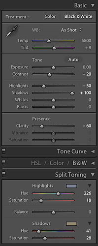
Lightroom Settings. Our Split Toning setup.
A restful, pleasant tour under gloomy skies.
For shopping, we just continued up the coast a short way to the new Lands End Lookout.
You can get cheaper T-shirts in Chinatown but the park store is a non-profit that supports the National Parks. And there's a lot more than clothing available, some of which is even educational. Even if you don't have a dime, it's worth a visit because there are a few historical artifacts on display (found on the site during construction) and some visitor tributes worth reading, too.
One person in our group had a particularly long shopping list (or was getting everything gift wrapped, we couldn't be sure). To pass the time, we hung out in the parking lot taking a few shots of the gray and indistinct vistas.
We knew at the time we were going to have a hard time processing them. But we looked forward to the challenge. They are abstract compositions in a sense. Blocks of monochromatic color with indistinct edges.
The usual edits would be the wrong approach. You don't want to heighten contrast and pull out detail with Clarify.
But it's hard to stop yourself. It's as if Lightroom, which we used for these images, was designed by Group f64.
So to reset our aesthetic sense, we spent a little time looking at the work of William Dassonville. A portrait photographer, he was an older neighbor of Ansel Adams who admired Dassonville's Charcoal Black printing paper.
Dassonville's soft images are, it has always seemed to us, a better fit for San Francisco's climate than Group f64's razor sharp images. His blacks fade into layers of grays and there's no attempt to make things sharp. Horrors, right?
Well, maybe not. How could we do that in Lightroom? No problem. Dial back your Blacks and Clarity (see the details in our screen shot above at right). And don't Sharpen on Export.
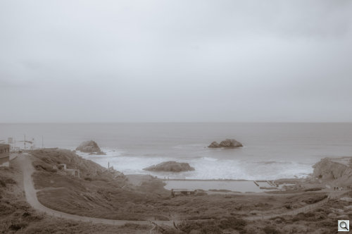
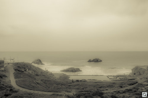
Dassonville also used toned prints. We tried a few variants. A split-tone of cool highlights and warm shadows. A warm highlight with neutral shadows.
Each of these approaches conveys a different sense of the place:
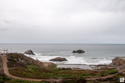
- The natural color provides the most information, though it's a little too crisp.
- The warm highlight Dassonville technique gives the images an antique look with a welcoming glow.
- The cool/warm split-tone is an odd match but conveys the chill of the air and water against the warmth of the grounds and buildings.
We're presenting all three here as an illustration in expression. The two monochromatic treatments are distinctly different from the original color images, as if they were taken with a different camera and lens. And there is a significant difference in the effect of the two monochromatic images as well.
So this isn't about which is best. They're equivalents. Choices. Derived from the same original data using the same software program (and no enhancements like presets).
Not that we don't have our favorites.


