Photo Corners headlinesarchivemikepasini.com
![]()
A S C R A P B O O K O F S O L U T I O N S F O R T H E P H O T O G R A P H E R
![]()
Enhancing the enjoyment of taking pictures with news that matters, features that entertain and images that delight. Published frequently.
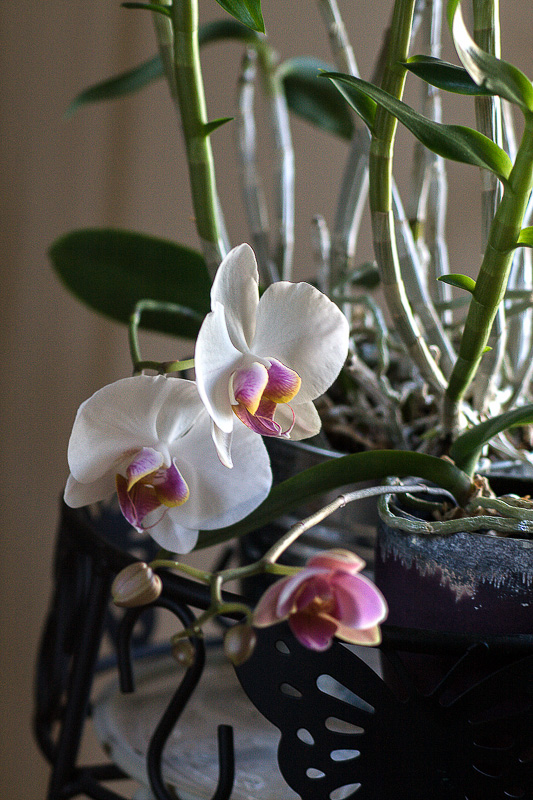
Friday Slide Show: Easter Orchid


3 April 2015
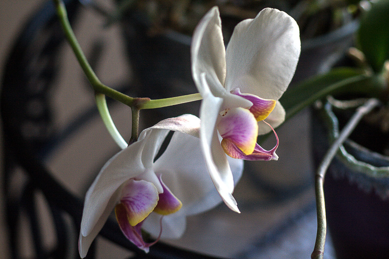
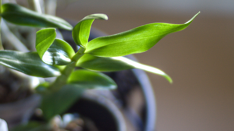
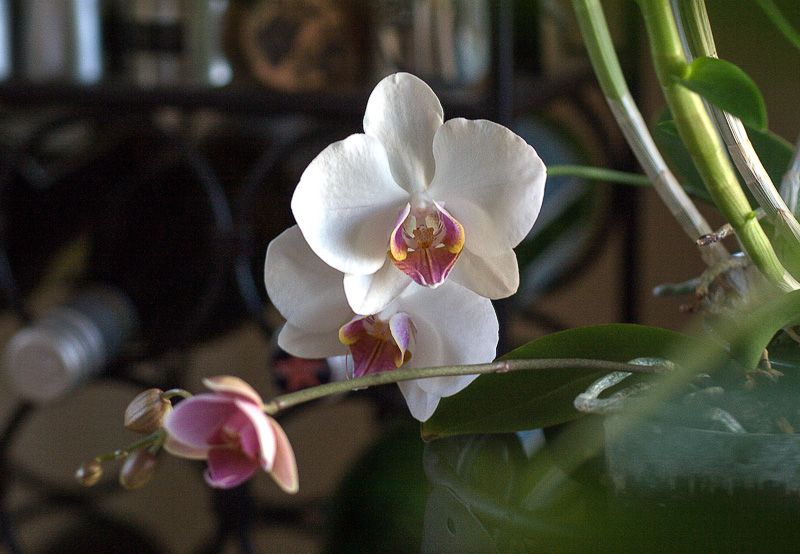
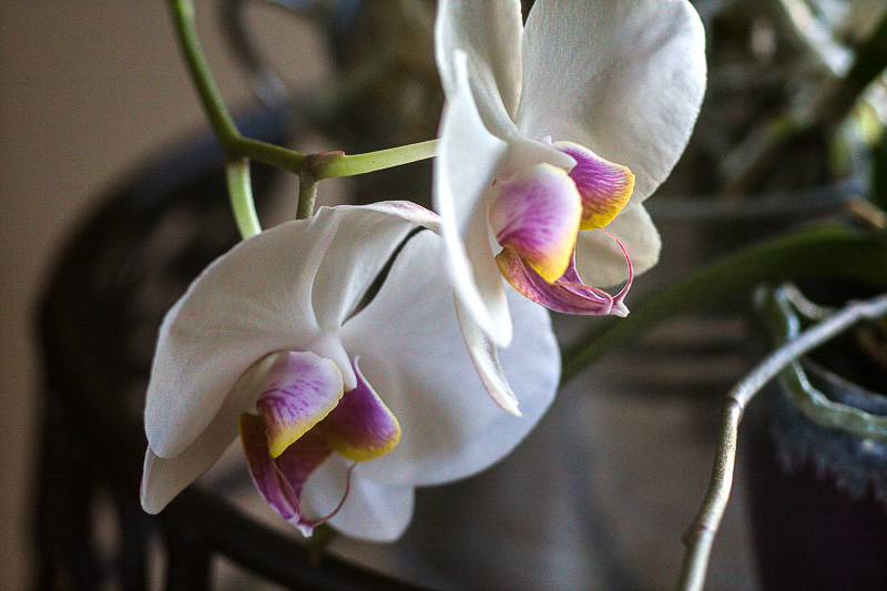
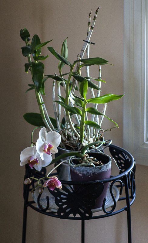
We had other ideas for today's slide show. But the recycling truck was later than usual this morning, so we kept walking over to the dining room window to see if it had come yet. And by that accident, we discovered the light falling on our Easter orchid.
A northern light, whose quality painter's love. Diffused. It fell so softly on our just-bloomed orchid, we were mesmerized. So we dashed down to the bunker to grab the Rebel XTi with the Lensbaby Edge 80 optic and capture the sight.
It's a harder shot to get than it may seem. The stand isn't very tall so you have to get down on the floor. We don't mind ending up on the floor at the end of the evening, but starting the day that way is disconcerting.
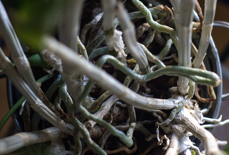
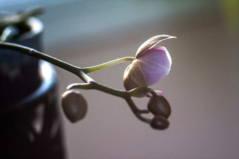
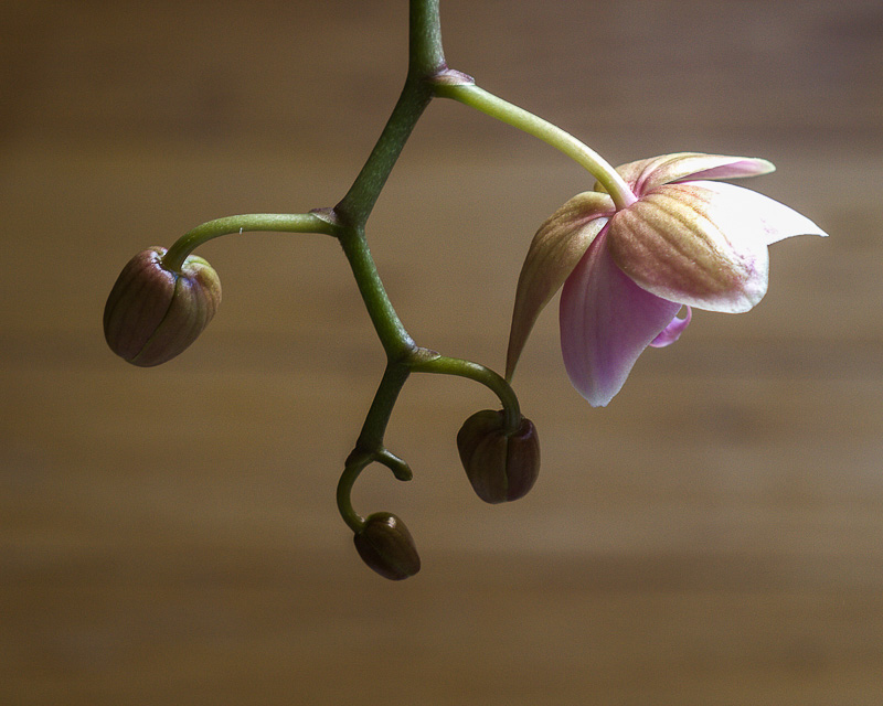
So we tried a few other angles, like straight down. It looked good whatever angle we took. Then it struck us that the flower wasn't the only actor on this stage. The dried stalks were tangled when seen from above but gracefully fluted from the side, for example.
We don't mind ending up on the floor at the end of the evening, but starting the day that way is disconcerting.
This could be a class in image composition, we thought aloud. No one heard us, fortunately. Because, you know, it could also just be fun. Rare is the subject of a portrait, after all, that doesn't eventually whine, "Did you get it?" These buds didn't budge.
But did we get it?
No camera LCD tells the tale. In fact, they don't even reproduce a good color gamut. And if you are shooting Raw, as we were, you're just getting an automatic rendering that has little to do with what you've captured and how you will eventually render it.
You do want to watch your exposure. Get it in the ballpark. Look for any problems like blown highlights or shadows that are void of detail. Watch your focus, too. Not too shallow, not too deep.
We were in close-up mode on the Edge 80, shifting between f2.8 and f11 with stops in-between.
But the camera only takes you halfway these days. Post processing develops the image in the direction you really want to take.
We wanted contrast. We wanted sharpness.
But a few of the handheld images were blurred. Camera blur. Grumble. We hadn't been able to tell on the camera's LCD. But we also didn't want to give them up. Post processing can't do much for blurred images. You're still better off reshooting.
So we did, with the old tripod we refurbished. Diffused light lasts, of course, so what we loved about the light was still there waiting for us.
Then we returned to our post processing in Lightroom 5, where we use Camera Raw to zip through a selection of images in the Develop module. Beats Photoshop hands down. And it's easy to go back and forth between the images to compare them.
We have never worked on a set of images that required so many of the sliders in the Develop module (not to mention on that last image, the Upright tool). We started with Clarity to increase microcontrast and sharpen things up.
Then we focused on hitting the Highlights and Whites settings before moving both the Shadows and Blacks sliders. The histogram was our friend through this but the image itself held the tie-breaking vote. The shadows, after all, were not the subject. The highlights were.
But we found, even after that, that a judicious kick to Exposure and Contrast helped enormously.
And even then, some shots just weren't telling the right story without a pretty severe crop. Just a couple, but the crop made all the difference.
We were ready to go when we remembered how much help Piccure+ has been lately and how we were thinking about including it in our workflow. Which, um, we had (in our excitement) forgotten to do.
We we ran the DNGs of our selection of images through Piccure+ using the default settings and imported those TIFFs into Lightroom. Again our tonal and color changes (which, technically speaking, are not corrections) were not quite as severe as they had been on the camera files, letting us focus on more artistic choices. Happier than we had been with the first set, we exported them.
And that's what you're looking at. Hope they floor you.
