Photo Corners headlinesarchivemikepasini.com
![]()
A S C R A P B O O K O F S O L U T I O N S F O R T H E P H O T O G R A P H E R
![]()
Enhancing the enjoyment of taking pictures with news that matters, features that entertain and images that delight. Published frequently.
Friday Slide Show: Subtle City


10 April 2015
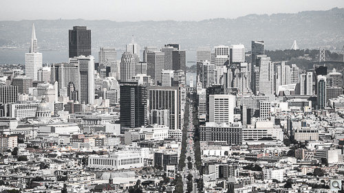
To some minds, there's nothing subtle about San Francisco. But just be patient and something you might have missed will make itself known. Cities, for all their stimulants, are specialists in subtleties.
We had hiked up Twin Peaks before we had any rain this month so the sky was less than crystal clear. It was more Tupperware clear. We had a polarizer on our 18-200mm lens, crossed our fingers and hoped for the best.
As usual, we improved on that with some Clarity but we quickly saw that color was not going to cut it. So we went monochrome.
Or did we?
Well, we did at first. But with our The Gray City slide show fresh in our mind, we thought we'd try a little subtlety. With a twist (like a refreshing Campari and soda).

Vibrance. Still some color. But more to the story.
In the Gray City, we adjusted Saturation to various levels to knock down overall color. Each shot had its own optimal setting and we futz interminably trying to find it.
This time we tried a difference approach, killing Vibrance and leaving Saturation alone.
This, too, keeps some color alive (ah, now you see it) but its more discriminating than Saturation.
As Adobe explains:
Vibrance. Adjusts the saturation so that clipping is minimized as colors approach full saturation, changing the saturation of all lower-saturated colors with less effect on the higher-saturated colors. Vibrance also prevents skin tones from becoming over saturated.
That gives you a clue to what happens when you increase Vibrance. But what happens when you decrease it? Less saturated colors are not protected and more highly saturated colors are dampened but not dropped. So you end up with some color.
But we didn't leave it at that. We found the Vibrance-only approach a bit too bland. You might entirely miss the color, in fact. So we did resort to punching up Saturation (sometimes quite a bit) to give the images a color cast and emphasize the surviving color.

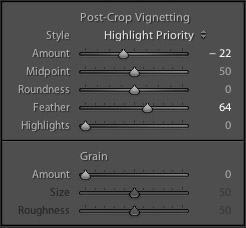
Vignetting. We preferred Highlight Priority.
The other thing we did that we just don't normally do is use a post-crop vignette (a vignette, that is, applied to the final crop, not the original one).
We tried both the Vignette 1 and Vignette 2 presets but played around with the settings a bit, changing the Amount somewhere between the two presets. We also Feathered the effect individually for each image.
We tried different vignette Styles but preferred Highlight Priority because it suppressed the effect in the highlights, giving it an uneven appearance in our landscapes (whose upper half would be skies and therefore highlights).
The overall effect is, well, subtle. There's something antique about the them, that's the initial impression. But as you look at them, you see the color (notice those poppies on the other side of the guard rail in the last shot?) and the detail of the modern not the vanished city.
It's not Portals To The Past so much as a suggestion that we are always looking with old eyes on the new that is subtly coming into view.
