Photo Corners headlinesarchivemikepasini.com
![]()
A S C R A P B O O K O F S O L U T I O N S F O R T H E P H O T O G R A P H E R
![]()
Enhancing the enjoyment of taking pictures with news that matters, features that entertain and images that delight. Published frequently.
The Worden Exhibit


17 September 2015
We've been logging a lot of hours in the old swivel chair lately so we packed a Domke and hiked down the hill and along the reservoir to Golden Gate Park to take a look at Willard Worden's photographs of San Francisco.
They'll be on view in an exhibit curated by Jim Ganz in the photography room of the de Young Museum through Feb. 14, 2016. Titled Portals of the Past: The Photographs of Willard Worden, which includes several hand-colored prints along with his sepia and untinted black-and-white prints.
WORDEN'S LIFE
Worden was born in 1868, a contemporary of Alfred Stieglitz and Edward Weston, and became a newspaper illustrator as a young man in the 1890s. His interest in photography was sparked during service in the Philippines with the U.S. Cavalry.
When he returned to the United States in 1901, he settled in San Francisco, publishing a catalog of city views just three years later.
The 1906 earthquake and fire forced him to relocate his downtown studio to the Western Addition. There he sold prints of the images he had made of the burning city and its ruins, most famously the Portals of the Past.
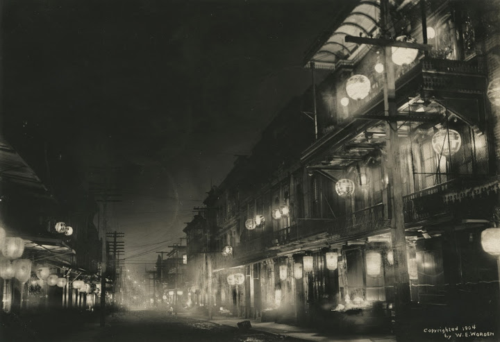
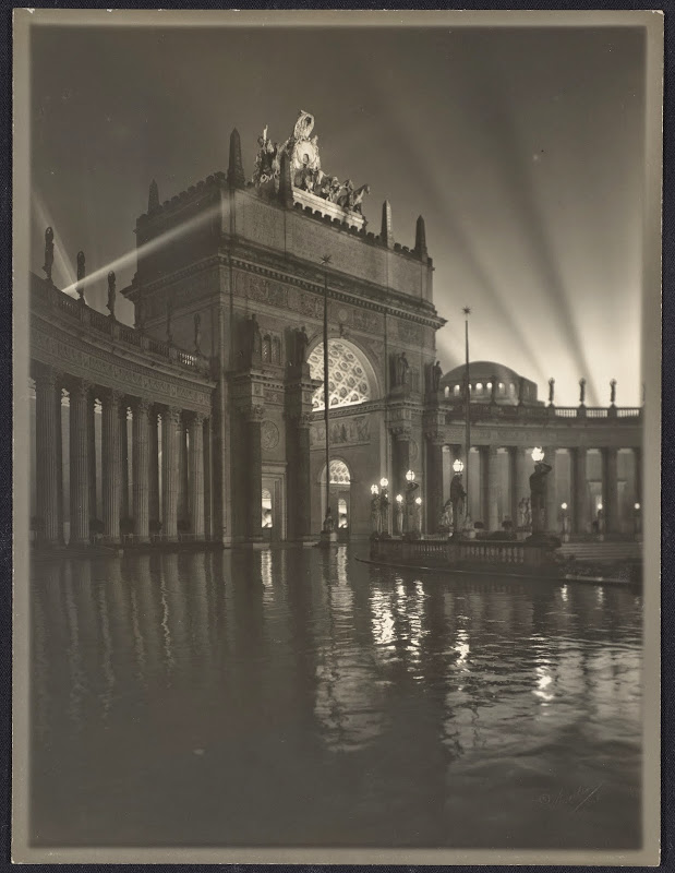
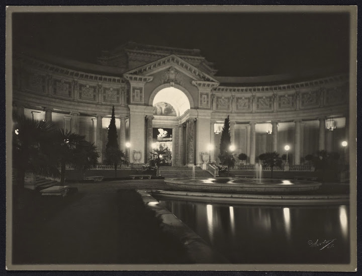
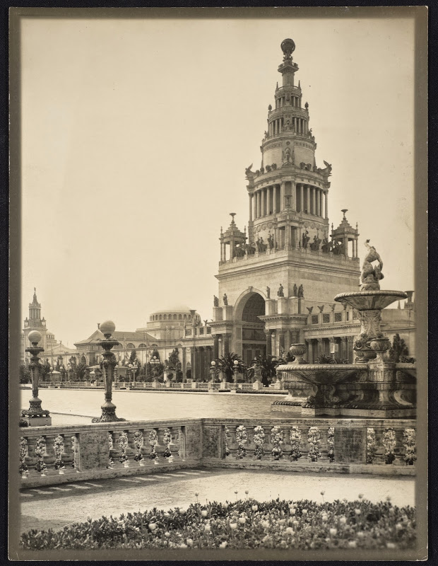
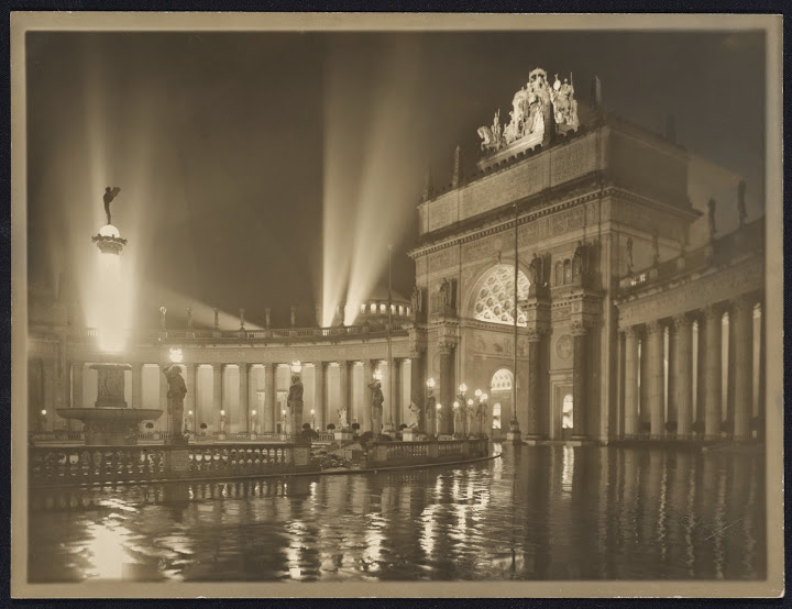
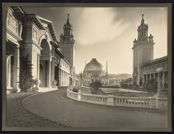
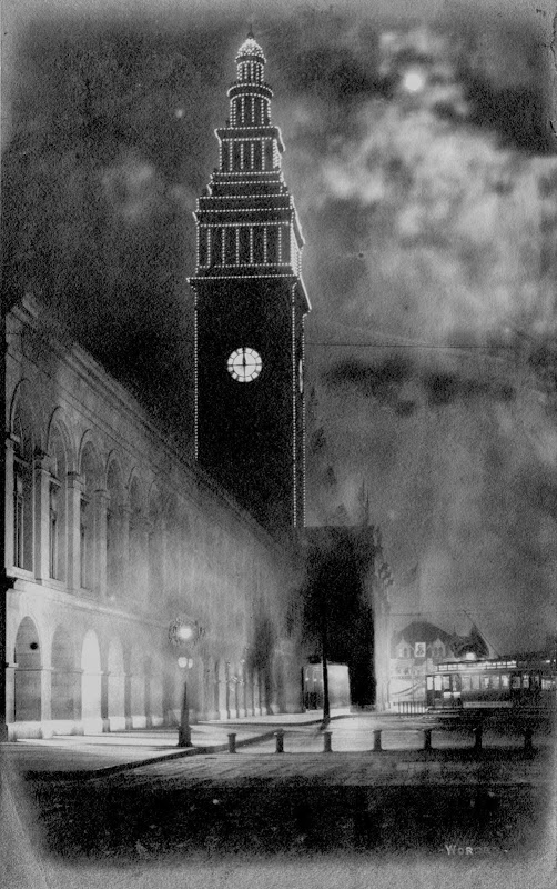
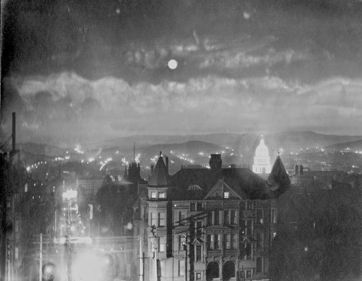
Subsequently Worden became a subcontractor for the Cardinell-Vincent Co. of San Francisco, which was the official photographer for the Panama-Pacific Internation Exposition held in 1915. He won a medal of honor at the Exposition and was widely acclaimed for his nightscapes of the floodlit buildings.
He devoted his energy to a new gallery downtown near Union Square after the Exposition. By the 1920s the Worden Art Gallery focused on paintings by local artists "while Worden's own photographs of the Bay Area's brightest and darkest moments were left to gather dust," as the exhibit's notes explain.
SUBJECTS
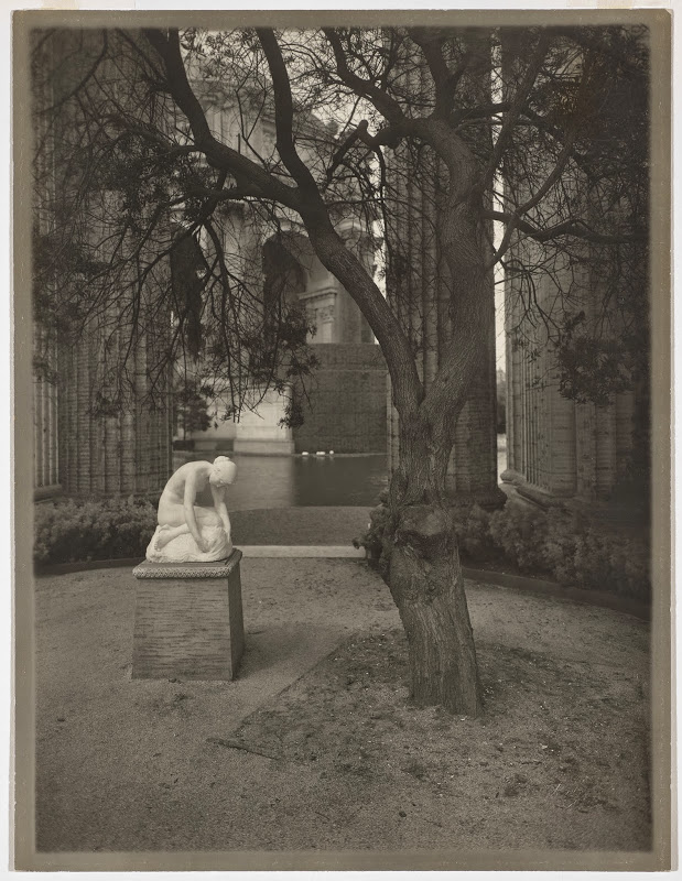
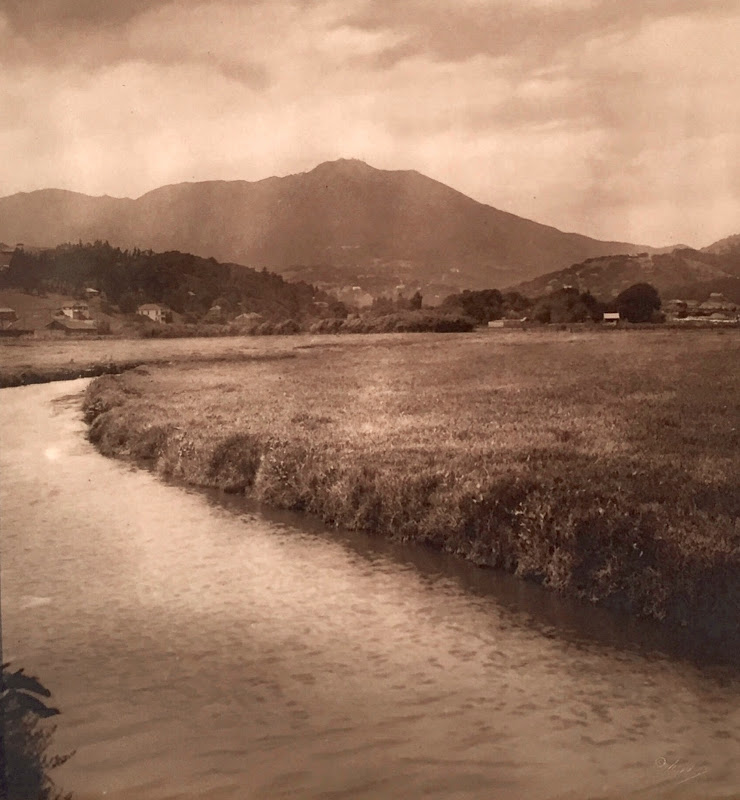
The exhibit displays a number of images he took of the 1906 earthquake and fire, a few before that, some from Yosemite and a good selection from the Panama-Pacific International Exhibition.
Worden's images of the city in 1906 were published in the San Francisco-base periodical Western Field: The Sportman's Magazine of the West, whose own offices were destroyed, forcing them to move temporarily west of Buena Vista Park.
The July 1906 issue featured "The Story of our Sorrow," a photo essay of Worden's images of the burning city and its ruins, which were added to the magazine's mail-order catalog of photogravures and prints for framing.
At the 1915 Panama-Pacific Internation Exposition, he won a medal of honor for his booth in the Palace of Liberal Arts. He had explained to the awards jury that his goal was "to stimulate the imagine, train the eye and mind to see and understand nature [through] artistic composition in negatives, selection of view point, light and atmospheric conditions."
He was admired for his nocturnal photography which captured the Panama Pacific International Exhibition in all its state-of-the-art, flood-lit glory. He liked to shoot at night just after it had rained to add the reflections of the buildings in the wet walkways to his compositions.
GRAY, SEPIA, COLORED
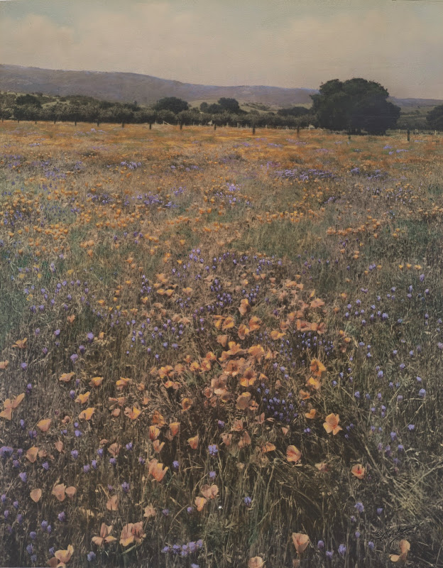
Worden offered his images in a variety of print sizes, some quite large. You could order them from his catalog as black-and-white gray prints. For the same prince, you could have the sepia toned. And for three or four times more, you could order a hand-colored version.
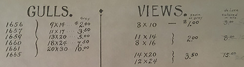
Catalog. Prices for variously sized prints in gray (untinted black-and-white prints), sepia and hand-colored.
His hand-colored prints "gave middle-class consumers a less expensive substitute for traditional watercolor or oil paintings to decorate their homes," according to the exhibit's notes.
Worden supervised the hand tining process after personally establishing the scheme for colorizing his prints. He would write detailed notes on the back of rejected prints criticizing the colorizing his assistants had done.
AESTHETIC
Worden practiced in an age of slow emulsions.
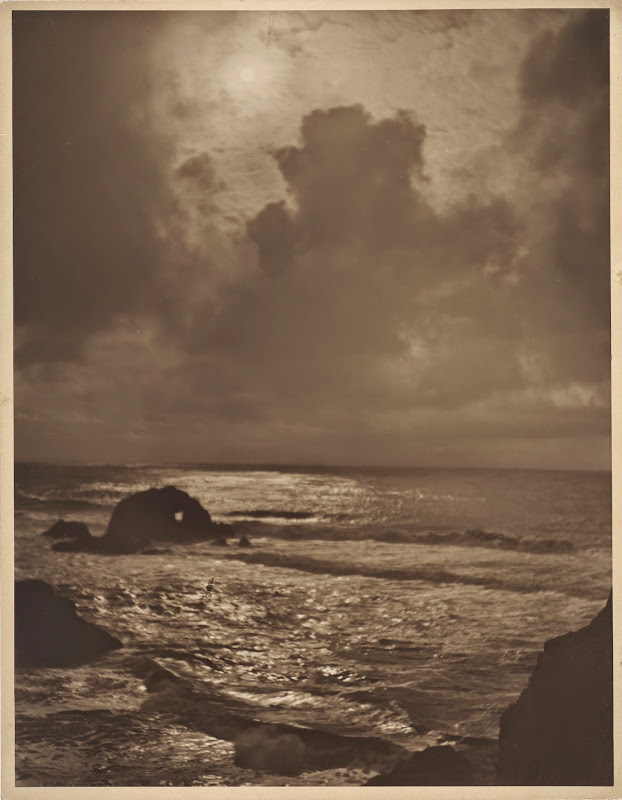
More than a few of the images exhibit a bit of blur from subject movement. A shot of the Golden Gate before the bridge was a glimmer in anyone's eye, taken from Berkeley, shows the bay's little waves in a confusion of focus. And a tall ship nicely cropped in a tall, narrow format, is disturbingly soft.
Typical exposure times of the era would have been "1/4 to 1/2 sec. for sea and sky, 1 sec. for open landscape, 2 to 4 sec. for landscape with heavy shadows near camera, 5 minutes or more for under trees, 10 minutes to 4 hours for interiors, outdoor portraits 2 to 4 sec.," according to the Ilford Manual of Photography at that time.
That's too slow to stop motion. Where the subject stood still, however, his images could be quite sharp.
Worden was no slouch in the darkroom, either.
He retouched his negatives with abandon. He added clouds and even removed the unfortunate spectator from his seascapes with a little opaque. And he was fond of compositing seagulls in his panoramic views of the Golden Gate and Seal Rocks.
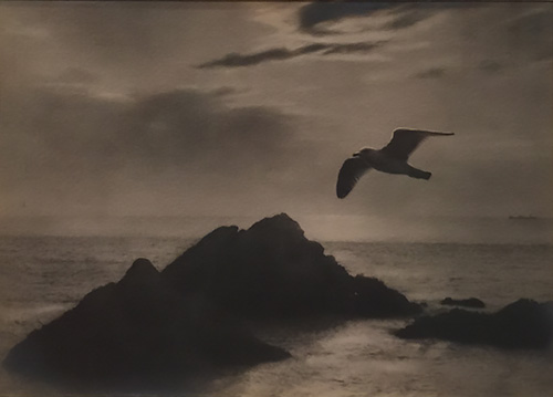
Gull, Seal Rocks Composite. From the Jerry Bianchini Collection.
In the above 1915 sepia-toned gelatin silver print, he composited a negative of a seagull to one of Seal Rocks. He would advertise these images in Our Navy, a magazine sold to visiting naval personnel with the tag line, "Send 'em home to the folks as a souvenir!"
APPRECIATION
Some of the photo cards we scanned in our Panama-Pacific International Exposition slide show may be Worden's work. But our affinity for him, we confess, goes deeper.
His subject, for one thing, was San Francisco. We don't have to imagine the fun that was. It's still fun for us today.
But he also showed an ingenuity that isn't ordinary. How he figured out how to shoot the Exhibition at night after the rain, his extensive darkroom retouching, his meticulous colorization. On all those counts, he was a man pushing the envelope.
We find some sympathy for his style as well. It foreshadows his fellow San Francisco resident William Dassonville's pictorialism, which suits San Francisco's foggy landscape quite well. And we applaud his daring in printing images that we would today be all too quick to reject for the blurred subject movement.
But we would be wrong to reject them.
Wandering through the exhibit a couple of times, we would listen to visitors marveling at those images, astonished at the devastation of the earthquake and fine, amazed at the majesty of the flood-lit Exposition buildings and falling in love with the Worden's flattering portrait of the city we all love.