Photo Corners headlinesarchivemikepasini.com
![]()
A S C R A P B O O K O F S O L U T I O N S F O R T H E P H O T O G R A P H E R
![]()
Enhancing the enjoyment of taking pictures with news that matters, features that entertain and images that delight. Published frequently.
Super Bowl Week


2 February 2016
San Franciscans are gracious hosts if not by nature then certainly by habit. We love our visitors and they, in turn, leave their hearts here. So we're getting into the spirit of Super Bowl week with this split-tone rendering of the Ferry Building decked out in Super Bowl 50 signage.
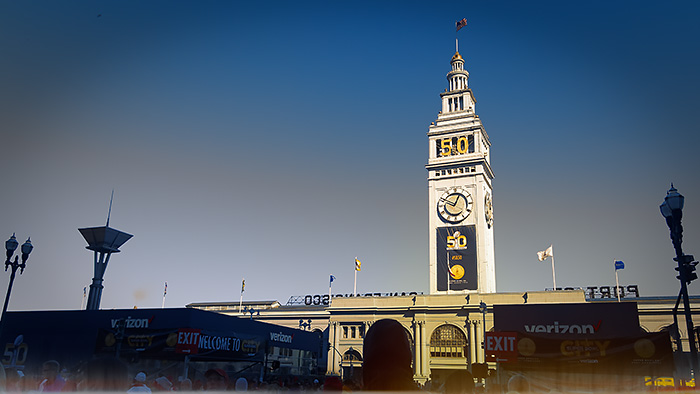
Ferry Building. Super Bowl City in the foreground.
The Raw capture was made with an Olympus E-PL1, which served as our street camera on a weekend tour of Super Bowl City in Justin Herman Plaza. As we've gotten into the habit of doing, it was converted to DNG on import.

Split Toning. Sepia and Gold matched California Blue and Gold.
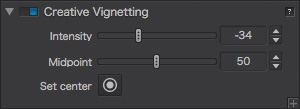
Vignette. To frame the image, we added a vignette.
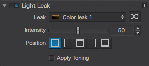
Light Leak. To add some interest to the dark foreground, we used a light leak.
We'd just shot a nicely composed image of the Ferry Building that was in portrait orientation. But we thought it would be useful to have a landscape image, too. As we framed it, we considered the dark foreground exposure but decided to let it go dark.
With a Raw capture, we knew we'd have some latitude to play with that dark foreground later, restoring a little shadow detail while balancing it with the background or just pushing it black into a silhouette.
We decided to fire up DxO Optics Pro 10 to handle this image, cropping it a little tighter to get rid of some objects poking into the frame along the sides. DxO Optics Pro's default tone and color rendering looked good. But we didn't stop there.
We popped down to the bottom of the adjustments panel for FilmPack 5.
This wasn't a job for presets. We had specific treatments we wanted to apply and FilmPack 5 let us do just what we wanted.
First, we wanted to use split toning to give the image a blue-and-gold scheme. Those are the state colors. Blue for our luminous sky and tame ocean. Gold for the precious mineral mined from the state's hills and streams by the forty-niners in the 19th century.
Next we wanted to focus attention a bit more narrowly on the Ferry Building as it swam in the 16:9 frame. So we used a vignette to darken the corners. Think of it as using a spotlight to direct the audience's gaze.
Finally, we had to decide about that dark foreground. The vignette darkened it so there was no point fighting that by lightening the shadows. Instead, we thought we'd add a little visual interest by using a light leak effect. Which just happened to add a little fire (and gold) to the image.
You can never have too much gold.