Photo Corners headlinesarchivemikepasini.com
![]()
A S C R A P B O O K O F S O L U T I O N S F O R T H E P H O T O G R A P H E R
![]()
Enhancing the enjoyment of taking pictures with news that matters, features that entertain and images that delight. Published frequently.
A Different Angle


8 August 2017
There we were at Torpedo Wharf in the Presidio, which is right by the Warming Hut bookstore and cafe. There are great views of the Golden Gate Bridge to the west and the city to the east.
We weren't there long because, alas, the parking lot is not free and we had no cash. We just wanted to see if there were any whales cavorting around the bridge.
As we left the car a Jeep full of tourists sent an envoy toward to confirm the parking lot required payment. "Sorry, yes," I said. "Just about everywhere in the Presidio now." Your tax dollars mean nothing here.
And then as soon as we got to the foot of the pier, a couple of charming ladies asked us to take their photo with the bridge in the background. So we obliged, although we inadvertently took a video of them before we set the smartphone's camera app to still mode.
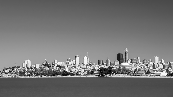
The monochrome version emphasizes the skyline while the color version alone can depict the charm of the sky and bay.
Time was running out on us. But not our luck.
We composed a few shots with the D300 and the 18-200mm zoom fitted with a circular polarizer. Some of the bridge, some of the city. Then we dashed back to the car and drove away before anyone could tag us.
This cityscape charmed us even though it isn't sharp and doesn't display well as a Web thumbnail (which is all we ever publish here). So we thought we'd have some fun with it.
One of the charms of the image is the blue of the sky in contrast to the green of the bay. Another is the changing skyline.
We present it to you here in two versions. The monochrome version emphasizes the skyline while the color version alone can depict the charm of the sky and bay.
And from where we were standing, the the naked eye could discern very little detail in the distance skyline. We zoomed in a little to 75mm to capture more than the eye can see.
That includes the Bay Bridge on the far left and Coit Tower. And you can see the Transamerica Pyramid as well as the dark Bank of America building. And right next to that (get used to it) is the new Salesforce tower. You can't miss the Palace of Fine Arts near the shoreline either.
But why make you squint?
We cropped the height of the full resolution image severely and resized it to 300 pixels so we could present a larger view:
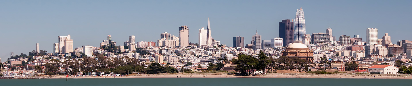
Ersatz Panorama. Use the scroll bar to see the whole city.
We made a few other edits to this image in addition to our usual tonal corrections.
There was a dark bird and a light small plane in the sky that we erased because, as we said, they weren't sharp to begin with and at these sizes they just seemed like blemishes. We did the same to some objects in the water.
We did a lot of Smart Sharpening as we reduced the size of the image.
And we decided to make a color shift to compensate for the polarizer. We went a little cooler. It's a cool city, after all.
One day we'll have to pay for parking, set up a tripod and make a sharper image of this view of the city. It tells the city's story from a different view point, one we find quite approachable.
Comments
The color image is nice and the "ersatz pano" is fun but for me the black and white doesn't work at all -- very unusually for your work. It looks heavily overcooked, with all the detail washed out of the illuminated buildings, whereas in the color version they have a touch of color which saves them.
-- Ken Cameron
That's an interesting observation, Ken. That blush of color adds something. Perhaps the illusion of detail more than any detail itself (looking at the building left of the Pyramid).
The monochrome image was an afterthought. But we grew to like it enough to make it the primary image in the story. But when it came to the pano, we decided to keep the color information.
It might be fun to provide hue sliders to play with the monochrome conversion. we'll have to look into that. Interactive editing.
-- Mike
Yes, I think it is the illusion of detail or maybe something which avoids the manifest absence of detail.
Sliders to play with the conversion would indeed be fun.
I do enjoy the San Francisco views. I haven't been there for 20 years and probably never will again but it will always have a place in my heart and memory.
-- Ken Cameron