C O N T E N T S
Photo Corners headlinesarchivemikepasini.com
![]()
A S C R A P B O O K O F S O L U T I O N S F O R T H E P H O T O G R A P H E R
![]()
Enhancing the enjoyment of taking pictures with news that matters, features that entertain and images that delight. Published frequently.
The Art Of Cropping


5 October 2017
One of our earliest introductions to the art of cropping was a book recommended by the staff photographer of a weekly publication which we art directed many years ago. Bill was a mentor, passing down camera gear to us, and discussing the finer points of press photography.
The book he recommended was published in 1971 as Visual Impact in Print. It was written by Gerald D. Hurley and Angus McDougall and subtitled "How to make pictures communicate; a guide for the photographer, the editor, the designer."
Nobody wrote books for photographers, editors or designers in those days. But the others explained the urgency. "Why a book on picture editing at this stage of the game? For one thing, the game isn't going well."
Pictures, they argued, usually got short shrift. Mainly because editors were word people.
FIRST THINGS FIRST
The book begins with a lesson on cropping. Because on the printed page there has never been a restriction on the aspect ratio.
Yes, the page itself is physically restricted to one particular aspect ratio, which varies by publication. But the picture printed on the page can be any aspect ratio.
Having spent years cropping pictures for magazine layouts, we did not make friends with the old Saunders easel in the darkroom, nor the 8x10, 5x7 or 4x6 papers we bought to make our first prints.
But on the Web at Photo Corners we're back in our element. The unrestricted aspect ratio. The freedom to crop.
OUR TEST IMAGE
Cropping is a laboratory exercise. So we've selected a recent image to play with It was taken in the alley beside SFMOMA when we were still heavily under the influence of the Walker Evans Retrospective.
We had the sense to squat down to sidewalk level and point the camera up enough to catch the brighter lanes of Third St. in the background. But the camera capture did not win us over. We should have taken a couple steps forward, probably.
But it makes a nice test image because how you crop that can in the composition makes a difference.
FULL IMAGE
So here's the full crop. What does it convey?
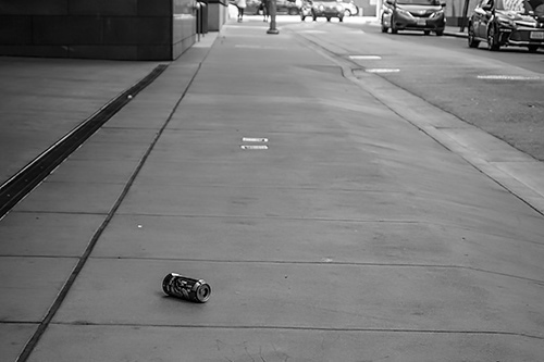
Can One. Full crop as captured in the camera.
Although the can is in the foreground, you'd be forgiven for suspecting the shutter button had been inadvertently pressed when we lowered the camera. It just doesn't look intentionally composed.
The can is close to the bottom of the frame but the photographer is not close to the can.
So it's time to make a selection.
SQUARE CROP
One of the easiest crops to try is a square. It takes no skill to make a square selection (you just have to hold down a modifier key, typically the Shift key).
Here's our can in a square (well, two squares actually):
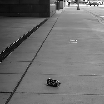
The crop with the can in the center of the frame makes the can prominent (oh, so that's the subject!).
But it is also a little disorienting because the sidewalk lines do not converge obviously enough.
The ones on the left dominate. And apart from the gutter, obscured by the late-morning shade, there's nothing on the right.
So the off-center approach promises an improvement by diminishing the importance of the left-hand lines
And placing the can in the lower left corner guarantees it is still prominent.
As a bonus, the parked car in the top right corner seems properly placed as well.
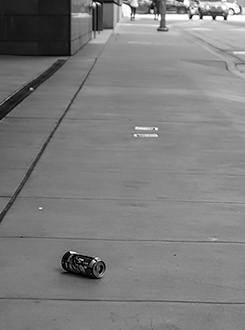
Vertical Crop. Why be square?.
VERTICAL
In fact, the asymmetry of the off-centered square does help. But it also raises a question.
Why be square?
It is, after all, a photograph of a sidewalk. And a sidewalk is not square but long and narrow.
So what if we leave our can in the corner, avoiding the darker entry way, and crop the alley out for a vertical crop?
That looks better.
You might be tempted to straighten the horizontal lines in the sidewalk but it would be a mistake because the building and lamp post have to remain vertical.
The reason the sidewalk line is not square is because it's a driveway, after all, which you can still detect on the right.
ALTERNATE
But let's say that disturbs you. Or say a vertical isn't going to work with your layout.
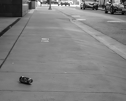
An Alternate Crop. Same principle but a different aspect ratio.
What else could you do?
You could expand the frame to include more of the alley. That certainly shows the driveway and minimizes the horizontal lines in the sidewalk.
CONCLUSION
There really isn't one perfect crop for any image, but almost any image can be improved by a judicious crop (particularly those taken in haste).
As Hurley and McDougall write:
Rarely is a crop absolute. A bit more or less will not normally hurt the picture's composition. Indeed this give-and-take in the picture's frame can often solve an awkward layout problem.
In this case, putting the can in the bottom left corner makes all the difference. It asserts its prominence. And we can then deliver any of several aspect ratios that work without diminishing it.
And if we had to print it? Well, that's what custom cut mats are for. And you can do that yourself with a Dexter mat cutter.