Photo Corners headlinesarchivemikepasini.com
![]()
A S C R A P B O O K O F S O L U T I O N S F O R T H E P H O T O G R A P H E R
![]()
Enhancing the enjoyment of taking pictures with news that matters, features that entertain and images that delight. Published frequently.
Site Tweak: Recent Releases


26 October 2017
The stack of review books was threatening our safety here in earthquake country. We'd read the things but we hadn't had the leisure to sit down at the piano and keyboard a review for each of them. One-man bands are sometimes short of breath.
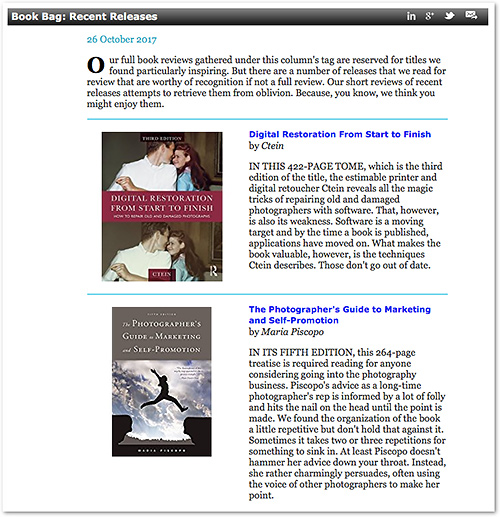
But we woke up yesterday with a vision of a shorter round-up of the books we want to bring to your attention but that we haven't had a chance to write up. Just a thumbnail of the book jacket and our radio-interview opinion, so to speak. With a discounted purchasing link.
A RECOMMENDATION
Were there a skeptical reader somewhere out there unfamiliar with our uncompromising ethics, they might think this is all a ploy to bring in cash. But you know better.
In fact, there are quite a few more books we've read (at least in part) that we are not brining to your attention (even though you might buy them). They just didn't win our admiration. And that's what it takes to get our recommendation.
Which is what these mini-reviews are, just like their big brothers. A recommendation.
DESIGN
It was a fun but tricky process to actually implement our vision, which did not come with the requisite CSS let alone a clear view of what the page should look like.
We tried a number of things yesterday afternoon.
A column of centered thumbnails of the book jackets seemed like a good way to handle the inevitably odd-sized collections. But on the left or the right of the description?
And would white space be enough of a demarcation between titles or was something more required? To keep the eye in bounds, you might say.
It was a fun but tricky process to actually implement our vision, which did not come with the requisite CSS let alone a clear view of what the page should look like.
And what about the link? On the book jacket or just the title?
And what about the price?
DECISIONS
As we said, we tried all those options out but we simplified the presentation for the very same reason we never got around to full reviews: time. Your time, this time, not ours.
There's the book jacket for reference. There's the bold title linked to a discounted price so the investment is just a click away. With the author's name, which may matter a lot.
And then there's our one paragraph summary, led by a capitalized phrase.
We added our usual disclaimer at the bottom so you know purchasing at discount from the affiliate links helps the site and not just you.
And that's about it.
STYLE TOO
Well, not quite.
We modeled the page using HTML tables at first because, well, it's tabular data. But that wasn't a flexible enough design.
It irked us, for example, that added padding to the table cells meant any rule separating entries would be a few pixels short of full width. And it was decidedly quirky to line up the thumbnail with the title.
So we just moved to a few lines of CSS to lay out the tabular data. That made it easy to try a few more tweaks, adjust the space between the thumbnail and text, etc. In a few minutes, we had what we wanted.
We thought we'd go live before we tried it out on the narrow phone screen. We're still working on that. Our first attempt just removed the new styles so everything would lay out straight down the page. That didn't really seem necessary, though, so we removed that.
But we weren't done.
MARKUP
We write articles for Photo Corners in a simple text editor whose ASCII text is processed with a mere drag-and-drop by a mere 953 lines of Perl into the HTML pages you read on the site.
So we had to conjure up some markup for the new format and make sure that the Perl program could reliably convert it to HTML.
That was pretty easy, too. Just two (complicated) lines of Perl and one new tag. Just to make it easy on ourselves, we created a new template (we use about half a dozen templates for the site) for Recent Releases.
OK, we were finally done. It was time for the World Series (and dinner) anyway.
FEEDBACK
We always defer to your opinion of these monumental design diversions. Well, we listen at least. Because if it doesn't work for you, it isn't worth our time doing it.
So feel emboldened to let us know if the new feature is useful or if it's missing something helpful.