C O N T E N T S
•
•
Photo Corners headlinesarchivemikepasini.com
![]()
A S C R A P B O O K O F S O L U T I O N S F O R T H E P H O T O G R A P H E R
![]()
Enhancing the enjoyment of taking pictures with news that matters, features that entertain and images that delight. Published frequently.
Test Drive: Capture One's Editorial Color Grading Styles


17 April 2019
When Capture One introduced its Editorial Color Grading Styles in February, we grabbed a copy of all three style packs to test drive.
Each pack includes seven styles designed by one of three professional photographers and retouchers whose clients include Vogue, Harper's Bazaar and Cosmopolitan, among other publications.
You can use any one style just as it is to apply a particular look to your image or series of images. You can apply that style on a layer of its own (except for black-and-white styles) where you can adjust the Opacity to tone it down. And you can combine styles by placing them on separate layers where you can using masking techniques to exclude parts of the image from them.
So they're quite versatile, by which we mean fun to play with. And we've been having some fun on this test drive.
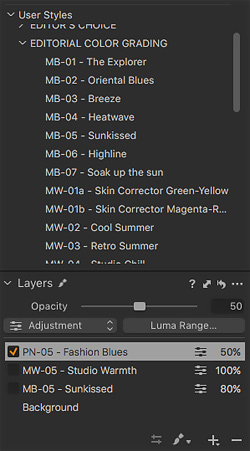
Panels. We added the Layers panel below the User Styles panel so we could activate and deactivate layers.
NOTES
We selected three different kinds of images, presenting different color problems to resolve.
Phase One makes it easy to see the effect of each style on the image. You simply roll over the style name and it is applied in real time to the image. Any active layers are included in the render as well.
We found it a bit difficult to appreciate exactly what was going on when we used our usual rollover buttons that change the entire image in an instant. So we've used an image comparison slider in this piece to let you swipe across the image to watch how the effect is applied to various areas.
While we experimented with all of the styles on all of the images, we're only showing you one style from each contributor per image. We also presetnt several Before/After examples from each contributor and a couple of video walking you through the workflow.
The Before/After images are all portraits, so we focused on landscape, flower and interior shots. The first two of those were DNG files but the third was a smartphone JPEG that spanned natural to incandescent light. We thought that might be a particularly intriguing image to grade.
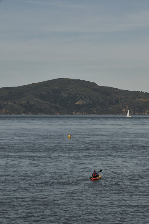
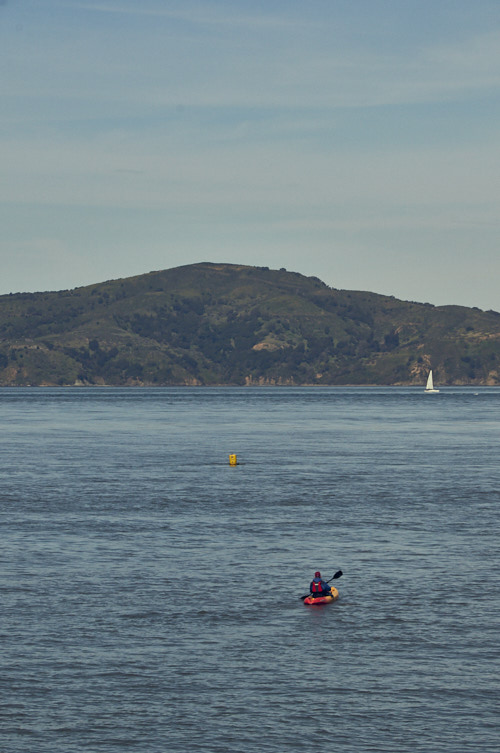
THE KAYAK
The kayak on San Francisco Bay presents a palette of blues with some green hidden in haze. We tweaked the DNG Raw file before applying a style on a new layer and changing the Opacity to optimize the effect.
Use the handle to slide the divider across the image to compare the effect of each style. We've highlighted one style from each designer in the order they appear in the sidebar to the left.
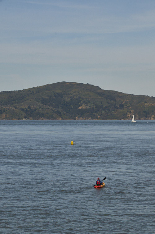
Marie Barsch. Explorer at 50 percent on a new layer.
Michael Woloszynowicz. Retro Summer at 50 percent on a new layer.
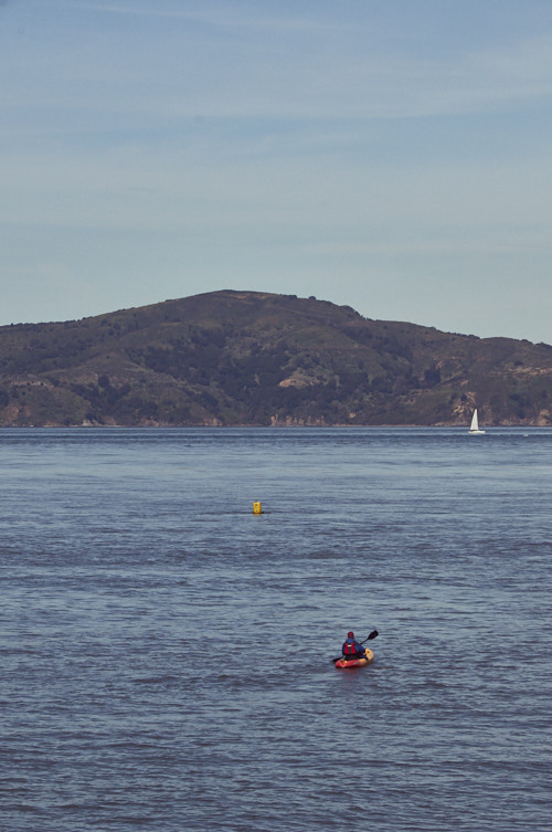
Pratik Naik. Regal Blues at 75 percent on a new layer.
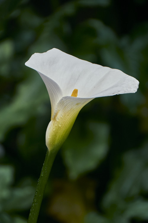
THE LILY
The lily is a high-contrast image with detail in the highlights, including a few rain drops, but nothing in the background shadows. The color palette stays in the greens, for the most part, with a touch of yellow.
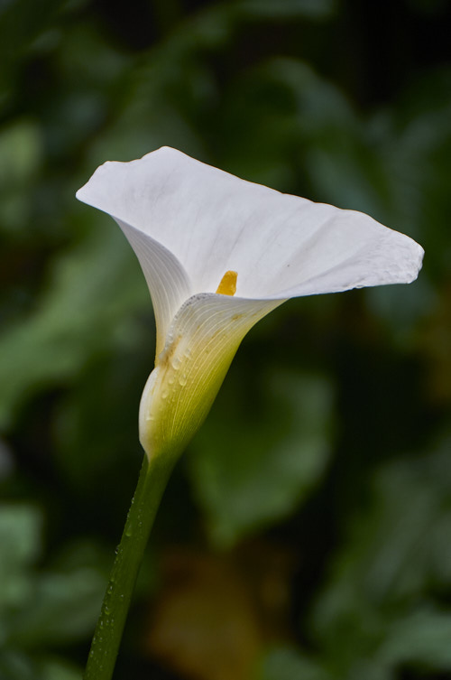
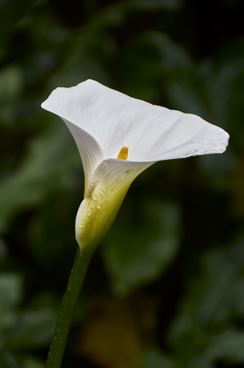
Marie Barsch. Sunkissed at 80 percent on a new layer.
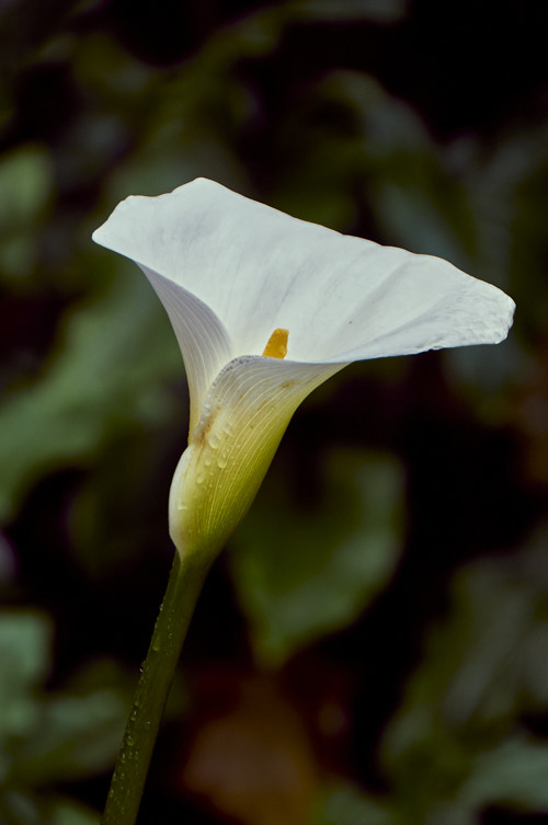
Michael Woloszynowicz. Studio Warmth at 100 percent on a new layer.
Pratik Naik. Fashion Blues at 50 percent on a new layer.
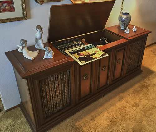
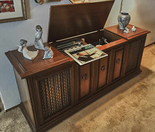
THE STEREO
Our final image is an iPhone 6 Plus JPEG with natural light coming from the left and an incandescent source on the right. So, yes, you can color grade JPEGs.
Note that the black-and-white styles are applied only to the Background. You can't add a new layer with them and change the Opacity, which would introduce ungraded color into the image.
Marie Barsch. Heatwave at 100 percent on a new layer.
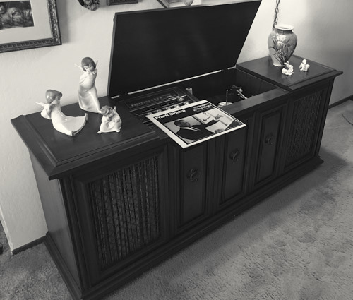
Michael Woloszynowicz. B&W Portrait on the background layer.
Pratik Naik. Hollywood B&W on the background layer.
MARIE BARSCH
Photographer Marie Barsch's collection includes the following styles:
- MB-01 - The Explorer
- MB-02 - Oriental Blues
- MB-03 - Breeze
- MB-04 - Heatwave
- MB-05 - Sunkissed
- MB-06 - Highline
- MB-07 - Soak Up the Sun
Her statement:
My Inspiration for these styles came from my favorite locations: Dubai, New York, Los Angeles and Cape Town. I'm travelling a lot throughout the year, but I always try to come back to my favorite places. Every single one of these places have something unique to it. May it be a special color palette or simply how it makes me feel. I tried to put all of that in this Style Pack of looks and basically transport the mood that I'm in when I'm shooting in Cape Town or under the Californian sun. When I am finishing my images the look and feel add as much to the image and my creative vision as, for example, the model's pose or the styling so, grading is a very important step for me to communicate what I have in mind when I'm taking photographs.
Her samples:
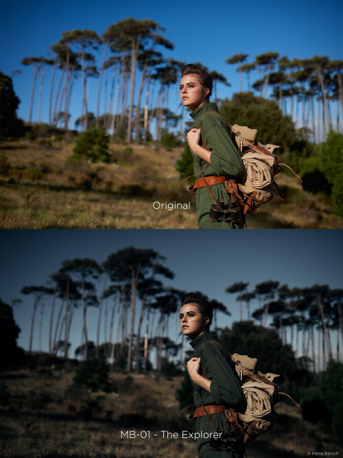
Marie Barsch. Explorer.
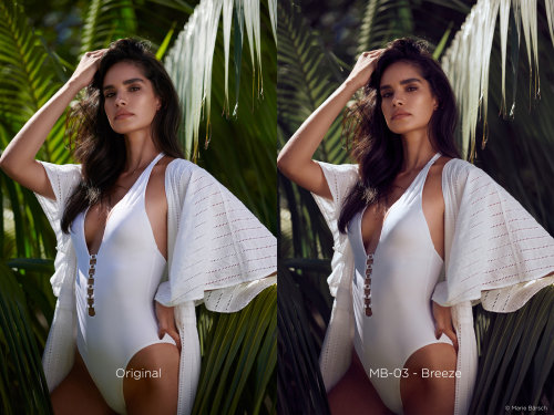
Marie Barsch. Breeze.
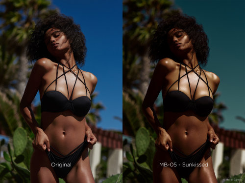
Marie Barsch. Sunkissed.
MICHAEL WOLOSZYNOWICZ
Los Angeles photographer and retoucher Michael Woloszynowicz of Vibrant Shot, created this set of styles:
- MW-01a -- Skin Corrector Green Yellow
- MW-01b -- Skin Corrector Magenta Red
- MW-02 -- Cool Summer
- MW-03 -- Retro Summer
- MW-04 -- Studio Chill
- MW-05 -- Studio Warmth
- MW-06 -- Warm Cool
- MW-07 -- B&W Portrait
He notes that while the styles are tagged for particular applications like correcting skin color or balancing studio shots, there is no reason not to try them on other types of images.
His statement:
The goal in creating these Styles was to focus around the colors and qualities that resonate with me across a variety of shooting scenarios. I'm typically drawn toward strong yet refined contrast as well as complementary colors and so that's what these Styles really focus on and draw from. Rather than aim for extreme variances between them, I wanted to keep them all within the same family so each one feels like a natural progression as you explore them on your own images. One area I find that we all struggle with, is to achieve a pleasing and neutral skin tone and for that I created two skin correcting actions. These actions are meant to take advantage of Capture One's ability to apply Styles to layers, so that their opacity can be backed off as needed in order to work for the widest range of skin tones possible. My hope is that they not only save you time but also serve as a source of inspiration for further manipulation and experimentation."
Woloszynowicz shows how he applies his style pack in this video:
He points out that the skin correction styles are over-powered at full strength so he usually uses an Opacity setting about 50 percent, which proves more helpful at bringing skin tones back to neutral.
His samples:
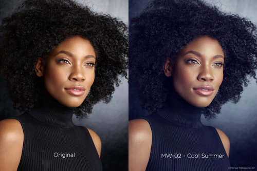
Michael Woloszynowicz. Cool Summer.
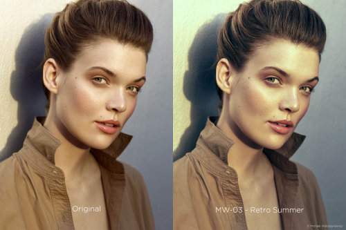
Michael Woloszynowicz. Retro Summer.
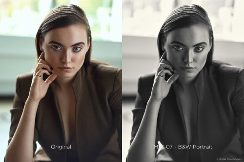
Michael Woloszynowicz. B&W Portrait.
PRATIK NAIK
Pratik Naik, founder of Solstice Retouch, has provided this set of styles:
- PN-01 -- Green Pastel
- PN-02 -- Moroccan Sun
- PN-03 -- Vintage Royal
- PN-04 -- Regal Blue
- PN-05 -- Fashion Blues
- PN-06 -- Classic B&W
- PN-07 -- Hollywood B&W
His statement:
The mission for this Style Pack is creating a set of colors that would be impossible to live without. With my history as a retoucher, there are common color palettes with high-end color grading that are hard to quantify in words, but easy to identify when you see it. This pack is special to me, it spans a range of looks that make for a beautiful starting point across all genres, especially fashion, beauty and lifestyle. The variation spans the spectrum of primary and secondary colors along with two timeless black and white looks. This collection of Styles will keep giving back every shoot you use them on. I can't wait for you to explore how your images will look mixed with my palette across different conditions.
He demonstrates the application of his style pack in this video:
His samples:
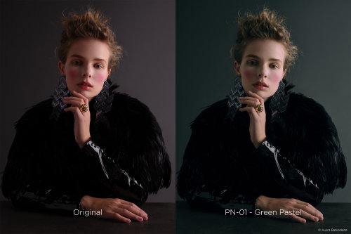
Pratik Naik. Green Pastel.
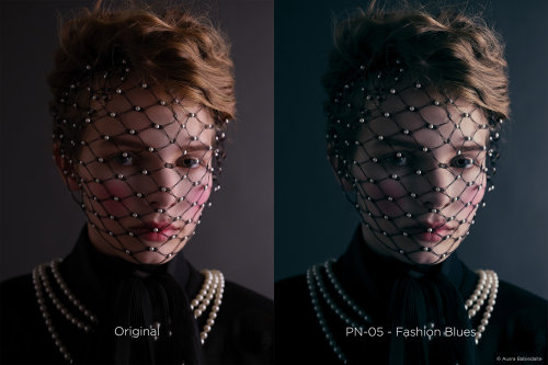
Pratik Naik. Fashion Blues.
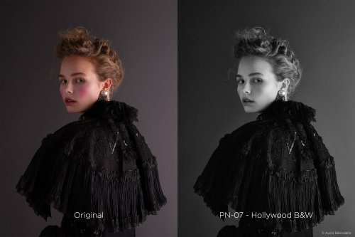
Pratik Naik. Hollywood B&W.
PRICE, AVAILABILITY
Available directly from Phase One, you can purchase a single style pack for $34 or all three for the price of two at $68.
CONCLUSION
Color grading has increasingly made its way from video tools into still image editing software this year. And it's a welcome addition, providing a consistent color treatment and mood to a series of shots that's also easily customized.
But these style packs stand apart from the many other color grading options we've seen. They were created by pros for their own use. It's a little like visiting a carpenter in his shop and being able to leave with a few of his favorite tools.
Can't beat that. So we're awarding all four corners to these styles packs.