Photo Corners headlinesarchivemikepasini.com
![]()
A S C R A P B O O K O F S O L U T I O N S F O R T H E P H O T O G R A P H E R
![]()
Enhancing the enjoyment of taking pictures with news that matters, features that entertain and images that delight. Published frequently.
A Hard Place


22 April 2020
The hills around here are chert, a crumbly red rock derived from sand not ideally suited to earthquake country. It presents a compelling subject where you can see the striations dramatically exposed in the sunlight. But it's a light red rock, which dampens the drama.
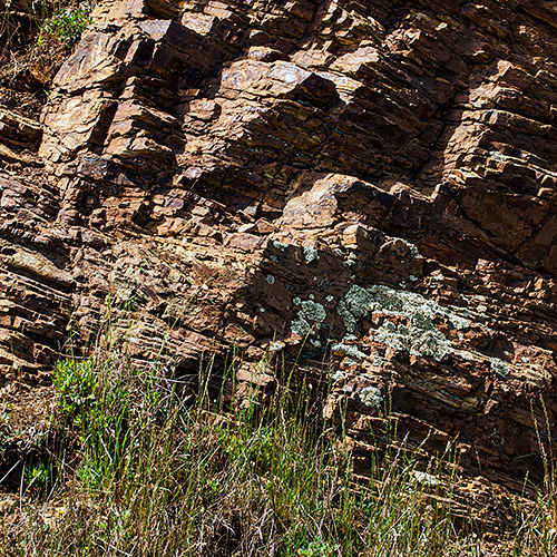
A Hard Place. Captured with an Olympus E-PL1, and 14-42mm II R zoom at 41mm (82mm equivalent) and f8, 1/200 second and ISO 200. Processed in Adobe Camera Raw with a gradient map applied in Photoshop.
We'll never get it right. We've tried and tried over the years. But the drama we see at the side of the road never quite matches what we pull out of the camera.
That in itself can be a license to go off the reservation.
So after tweaking the image to our taste, we applied a custom gradient map to it. We've been experimenting with gradient maps lately and like the help they can give to an image.
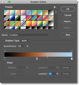
Gradient Map. The range of hues which we applied at 20 percent Opacity.
They apply either tones or hues to the tonal range of an image. So you can apply one color to the shadows, another to the midtones and a third to the highlights, for example. Or you can lighten the shadows, leave the midtones alone and darken the highlights if you prefer. You can, in short, alter color or tone to any tonal range in your original.
In this case, we ended up (after a bit of experimentation) with a black-ochre-blue range of hues applied to the image and then dialed back to about 20 percent opacity.
With the gradient map on a layer of its own, we also set the Blending mode to Multiply. Blending modes make quite a difference in how the map is applied, of course. So mind the Blending mode.
So what did this one do?
It added some depth to the darker parts of the image (which we could have done with the Black and Shadow sliders in Camera Raw if that's all we needed), increased the Saturation of the midtones on the rock and added a slightly cooler cast to the highlights.
By varying the colors along the gradient's slider you can warm some tones and cool others. We used three colors here but you can have any number of them. See for yourself:

And, as we mentioned, you can just manipulate the tones, if you prefer, applying a grayscale range that, again, can change values however you want.
We wanted a subtle effect but we wanted an effect we couldn't squeeze out of Camera Raw alone. If we didn't tell you about it, you'd never know how much work we did on this image, would you?
And we did spend some time fooling around with various gradient maps. The possibilities are endless.