Photo Corners headlinesarchivemikepasini.com
![]()
A S C R A P B O O K O F S O L U T I O N S F O R T H E P H O T O G R A P H E R
![]()
Enhancing the enjoyment of taking pictures with news that matters, features that entertain and images that delight. Published frequently.
Twin Peaks: A B&W Conversion


29 June 2020
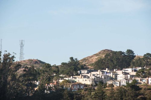
We came across this unusual view of Twin Peaks the other day and couldn't resist taking a photo. Imagine our surprise when we discovered we had been carrying a camera with us on our walk. Apparently we had planned all along to, you know, take pictures.
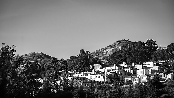
We're looking northeast. Usually the view of Twin Peaks is from the west. You can see why. They don't look like twin peaks here. And there are homes climbing up their sides, too. Unflattering.
But we were taken by the little people standing on top of them. Of course they're full-size people, but they seem to suggest that people aren't that big a deal when it comes to peaks. And we liked that.
We had to wrangle with the exposure and the color a bit. And we confess to obliterating an unsightly communication tower. Poetic license available upon request.
But, in the end, we didn't care for the color version.
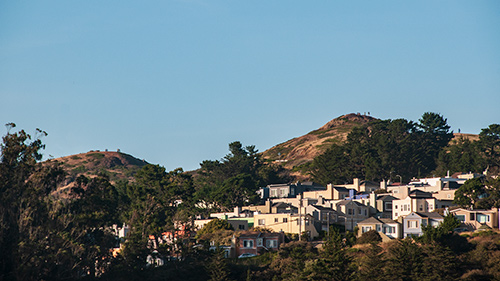
Twin Peaks. Color version captured with a Nikon D300 and 18-200mm Nikkor at 170mm (255mm equivalent) and f9, 1/1000 second and ISO 400. Processed in Adobe Camera Raw.
So we thought we'd see what our peaks would look like in black and white.
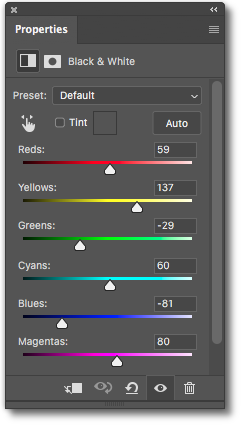
Hue Sliders. Not a straight conversion to monochrome.
That's when things got interesting. And by "interesting" we mean fun.
A straight conversion to black-and-white is simple enough in any image editing program. But, like toast without butter, it leaves something to be desired.
Even black-and-white film doesn't do a straight conversion, so to speak. Different hues are rendered differently with different black-and-white film types.
You can see that play out with emulsion emulators based on actual film scans.
So you can often optimize your monochrome images beyond mere tonal adjustments by fiddling with the hue sliders in a black-and-white conversion. And this image provides a good example of what a difference that can make.
In this particular case, we knew from the color version we wanted our trees and sky to be darker than the conversion. And we wanted our dirt to be lighter.
That accounts for the dramatic shifts in the Green and Blue sliders and the Red and Yellow sliders shown to the right.
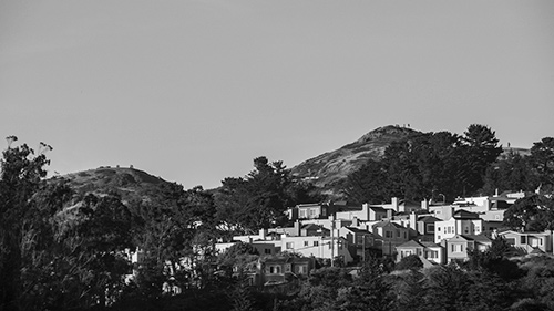
Below you can compare the hue-edited final image to the default black-and-white conversion.

We also added a vignette to darken the corners and draw the eye in to the peaks themselves.
Considering the color image we started with (below), we're pleased with the final black-and-white rendering.
Camera JPEG. The thumbnail from the Raw file shows what we started with.
Our edit of the color file (up top) certainly developed the Raw image data rendered in the above JPEG more pleasantly. But it just didn't make the image as interesting to look at as the monochrome version.
But that monochrome version really needed the color information from the Raw file to bring the image to life.