Photo Corners headlinesarchivemikepasini.com
![]()
A S C R A P B O O K O F S O L U T I O N S F O R T H E P H O T O G R A P H E R
![]()
Enhancing the enjoyment of taking pictures with news that matters, features that entertain and images that delight. Published frequently.
Friday Slide Show: Child Reading


19 February 2021
Sometime around the turn of the century we happened by (as one does when centuries turn) a curio shop whose windows were packed with the oddest trinkets. You had to stop to take it all in.
And when you did, you wouldn't move until you saw something you just loved or that made you laugh or raise your eyebrows. Once all three happened to us at the same time. We saw a pair of tiny pink pelicans fashioned as cartoon characters that turned out to be salt and pepper shakers.
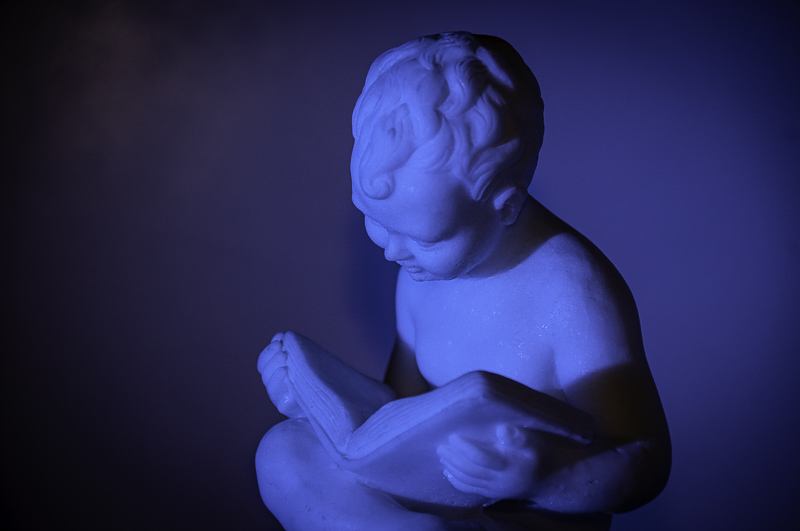
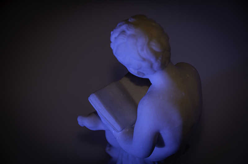
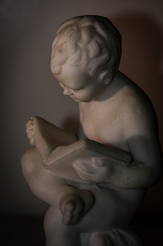
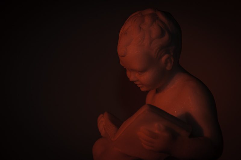
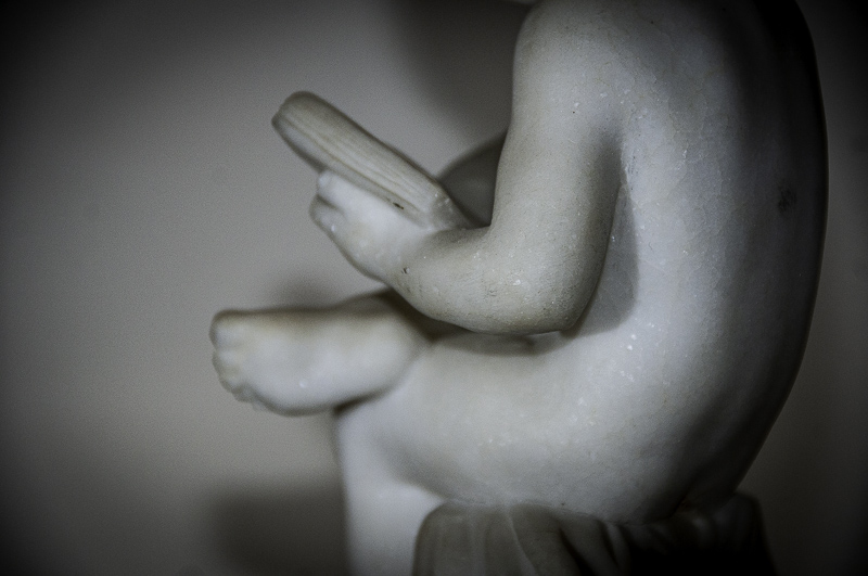
That little shop, long gone like the century, was where we found our little statue of a child reading. Not for a minute did we think it was valuable, having been pressed from dust into a form. But that also meant we would be able to buy it and take it home.
It has been with us in two homes for well over 20 years now.
And with it has been a slip of paper from a Chinese fortune cookie that we have kept on top of the open pages of the child's book. "To open a book brings profit," the fortune says.
By the time we were done fooling around, we had 71 exposures.
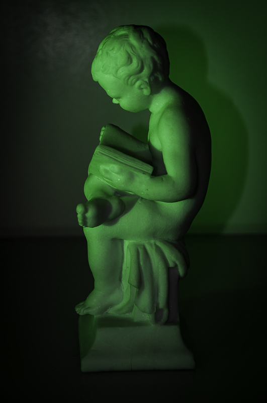
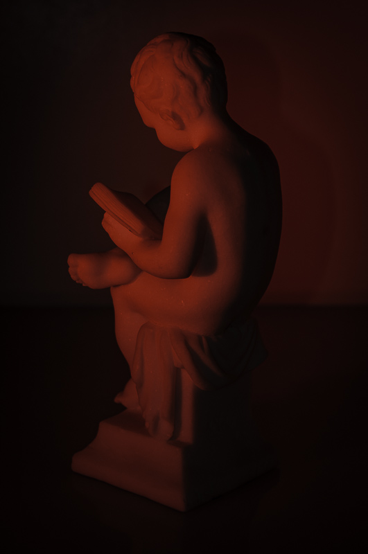
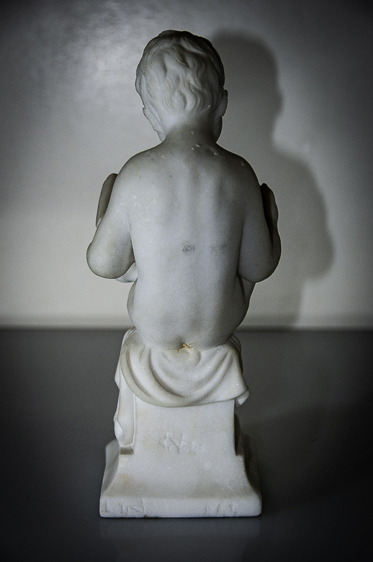
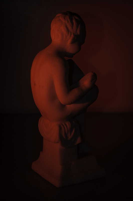
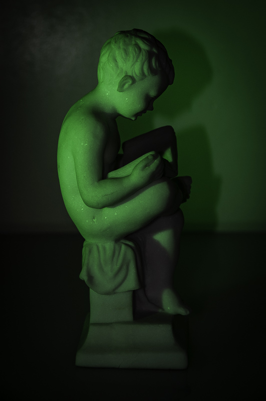
Last night as the neighborhood dogs were barking at the invading raccoons and coyotes, we set it out with a white background and a white bounce card facing a Nikon SB-800 strobe fitted with a Harbor Digital Design egg crate and colored filters.
We set the exposure between -1.7 and -2.0 EV and set the Nikon D300 to commander mode so the built-in flash just triggered the remote SB-800 mounted on a tripod to our left.
The egg crate modifier gives a directional light so we ended the session with just a diffuser. The color filters ranged from a warming gel to blue, red and green. On the red we added a warming gel modifier.
We were just experimenting. By the time we were done fooling around, we had 71 exposures. And were grateful we weren't still in the last century paying for film processing.
But our fun had just begun.
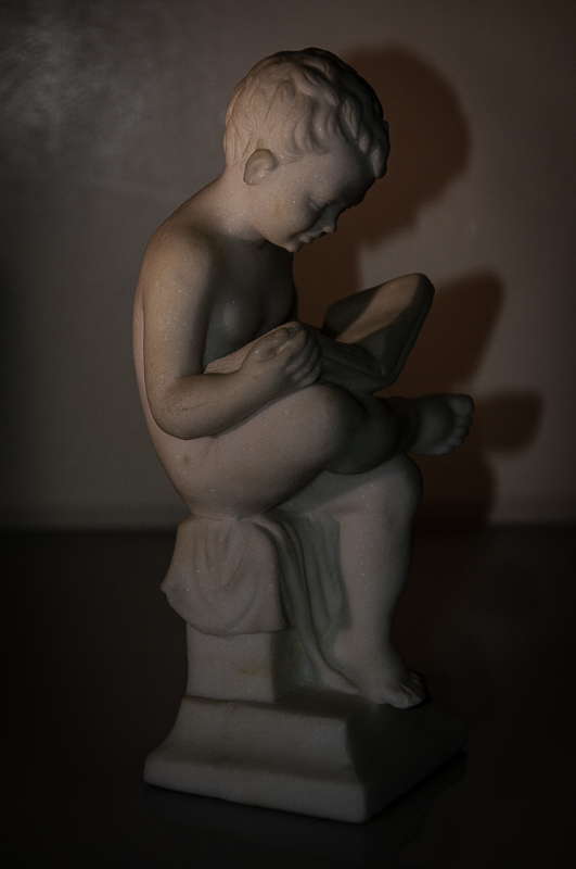
Much as we liked the exposures, we really enjoyed manipulating the color effects in Lightroom. Not all in one direction either. On some, for example, we had to dampen Saturation. On others increase it. Some profited in the shadows by a shift in tint, others were ruined if we did that.
Because we handheld the camera, we had to do a little straightening and cropping to get the images to line up with each other. That led to a little vignetting, which didn't hurt at all.
As we worked on the images, each in its filtered set, we thought this might be an excellent exercise for improving one's editing.
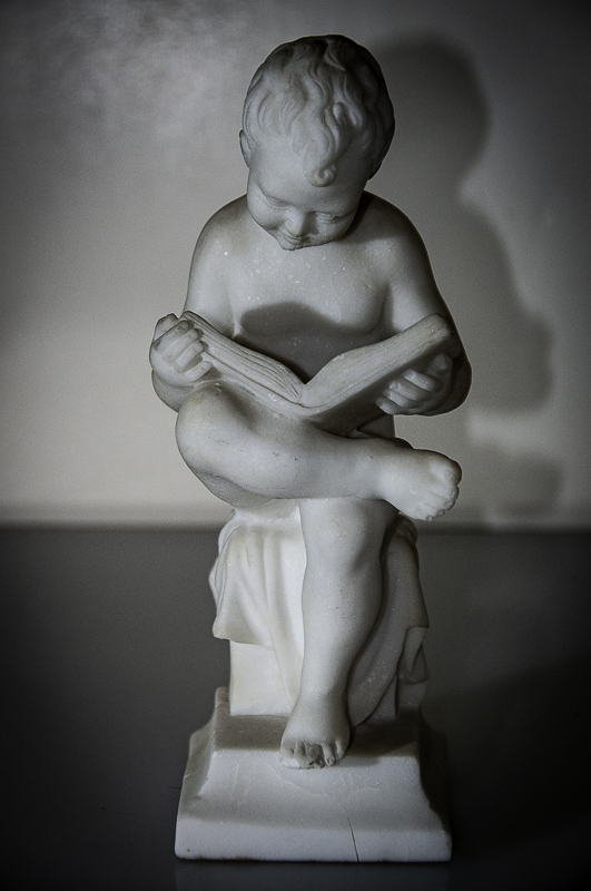
The tonality is paramount. You have to adjust everything. Exposure, Curves, the works.
But color is simplified so you can appreciate a shift from warm to cool or vice versa and see what a green or red shift brings to the party without getting confused by environmental color, the stuff you know by memory. Blue skies, green trees, that sort of thing.
You aren't, in short, tempted to edit toward reality. Just the opposite. You edit for a particular effect. Accuracy is not an issue.
You don't need a marble statue to do this. Any white object set on a piece of paper would do. An egg, a roll of toilet paper.
Give it a try. See which part of the game you liked best. The shoot or the edit. Either way you're bound to enjoy the exercise. We certainly did.