Photo Corners headlinesarchivemikepasini.com
![]()
A S C R A P B O O K O F S O L U T I O N S F O R T H E P H O T O G R A P H E R
![]()
Enhancing the enjoyment of taking pictures with news that matters, features that entertain and images that delight. Published frequently.
Making Inkjet Prints Again


2 February 2022
The day finally arrived. The three prints that have been hanging on the bathroom wall for years had faded beyond any pretense of being an image. It was time to replace or reprint them.
They have some meaning for us as a set, so we decided to reprint them. And this is the story of that adventure.
HISTORY
In April 2005, we wrote about the first time we printed this set of images. We'll reprise that piece below for the curious (among whom we count ourselves). Those were dye sub prints that lasted a good long while and were placed with dye sub prints that lasted until yesterday.
"Lasted" doesn't mean they didn't fade. It just means we didn't replace them. They were indeed faded in both cases. The wall gets diffused by strong afternoon sunlight. We wouldn't expect anything to hold up to that.
And yet, the 13x19-inch inkjet on the same wall as the window (and therefore not being hit directly by the sunlight) shows no sign of fading.
So we thought that this time around, we'd try some inkjet prints.
But not on art paper. On photo paper. Art paper is porous and would absorb the moisture inevitable in a bathroom. But photo paper, like the dye sub paper, would resist.
Our sister-in-law years ago convinced us it would be safe to hang the prints in the bathroom as long as we kept it from steaming up. We have a strong ceiling fan that vents outside and that window, which opens easily. They only time the room gets steamy is when a visitor neglects to turn on the fan.
So the prints have been fine but they've all been on photo paper.
FINDING THE THINGS
Since we regularly applaud the advances in image editing software over the years, we didn't just want to pull up the last edits and send them to the printer.
Instead, we planned to find the originals, re-edit them and print the new versions.
Where we didn't remember a file name (we did remember one) or a likely year (there was another one), we resorted to the camera make (which we did remember) using Lightroom's metadata filters on various folders in our collection.
And in no time at all, we'd recovered the three originals, copies of which we exported to a folder.
Organizing a collection of images is often more work than it's worth. All you have to do is concoct a scheme that will help you find what you're looking for when you've forgotten almost everything about it.
That's the test. And we passed it.
THE PRINTER
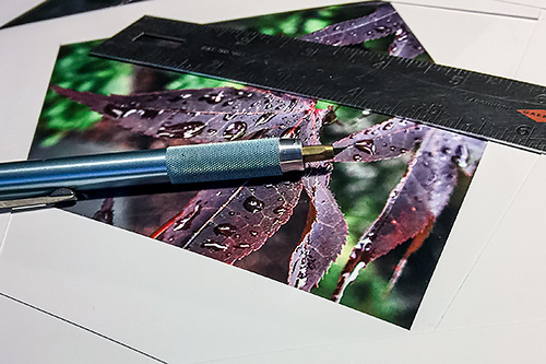
We'll skip the editing, because it was routine. We will confess to mistaking the final size for 5x7 when it was really 6x8. But we were able to backtrack in Photoshop's History panel to rectify our mistake.
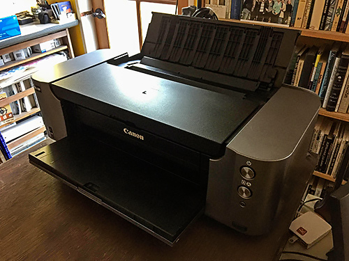
We hadn't used the Canon Pro-100 printer in years. We haven't printed an inkjet print in years, for that matter, relying on dye subs from the DNP DS-620A when we needed a print.
In fact, the prints we were replacing were DNP dye subs from the DS40, if we recall.
That means we've also been through a few operating system upgrades since we made an inkjet print. We weren't at all sure our old Canon drivers were functional.
But the first thing to do was turn on the printer. We remembered how to do that. Big chrome button on the front panel.
It lit up bright white, blinked and the big chrome Resume button below it blinked yellow. But the printer didn't make a sound. We remember it buzzing and wiggling the print head back and forth a bit on startup, just to waste some ink.
There's no screen on the printer. So to find out what's going on, we went to System Preferences and Printers and fortunately found the still-functional driver dialog telling us there was a B200 error, call Canon Service.
Nonsense.
That error indicates a failure of the print head. Replacing the print head costs a fortune. Cleaning one takes days.
But this print head had been parked in the printer's service station in a very mild climate, so we didn't think there was much chance there was anything wrong with it. Besides our rule of thumb is that hardware never fails.
That rule of thumb was born from investigating frequent failures. Almost all of them were software issues. Meaning poor software is the likely culprit for any failure.
We had no idea what we'd done with the manual. We must have reviewed this unit 20 years ago.
Rather than get out of our chair to look for it, we thought it would be faster to download it from Canon's support site. So we did. But after unpacking itself, it wouldn't install. It wasn't a PDF but some sort of application.
Oh, Canon, really?
We did find a query in the support site FAQ that told us how to reset the printer, though. Turn it on and hold the Resume button in until the Power button flashes. Our Power button was flashing immediately, but we held the Resume button in for a second anyway.
And the printer kicked into gear.
When the print head moved to the center of the printer off the service pad we were able to inspect the cartridges. They all had plenty of ink, even the ones flashing that they were low.
It went through a few other errors (we left things open) and warning messages (low ink) which we addressed or dismissed before a test print on plain paper came through. Success.
So we loaded it with Canon's Photo Paper Plus Glossy and went back to our chair.
PROFILING
Printing is a kind of translation. You translate the image formed by transmitted light on your screen to a credible equivalent formed by reflected light. You will never get the same range of brightness or even the same colors.
But what you get should be beyond good enough to something lovely in its own right.
To get there you have to use software that handles the translation. Profiles. The profile knows about the ink in the printer and the paper it will go on. We call them paper profiles but they only work on specific printers because they factor in the ink.
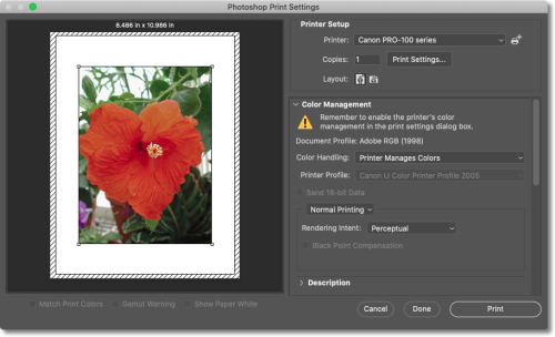
Photoshop Settings. Printer Manages Color.
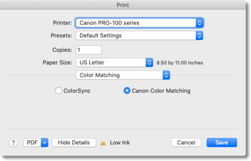
Printer Setup. Canon Color Matching.
We didn't have a paper profile for Canon's Photo Paper Plus Glossy. And we were not about to return to Canon's site for one that wouldn't install.
We did take a wild guess and tried to let Photoshop manage the color but it was a disaster. A very very dark disaster. And, frankly, when you are inkjet printing, you are doing it with something more expensive than good champagne.
So we succumbed to letting the printer manage the color using Canon color matching. That delivered usable results but it isn't the best approach.
It took us nine prints to get three framable replacements for our project. With a dye sub, we get it right the first time every time. Inkjet printing is expensive, in a word.
CONCLUSION
We do like to make prints. We believe in prints. But we are frugal too and don't like wasting ink and paper on a befuddling, unreliable process. Which is what inkjet printing has always been.
We're not happy with how we had to resort to default color management in this case. And if we were going to do a series of prints, we'd have spent a lot more time working out a more sophisticated but reliable solution.
But we just wanted to get three prints on the bathroom wall before anyone yelled down to us that someone the photos were missing.
Three Pictures in Search of a Wall
Near the end of our review of the Hi-Ti 730PS we slipped in a shot of three images "Waiting for a Wall." We wanted to show just how nicely the 730PS's 6x8 prints looked in 8x10 frames.
We're pleased to report that our pictures finally found their wall. Not that we deserve any credit for that.
After a great deal of persuasion by forces more powerful than ourselves, we agreed to hang them in the upstairs bathroom. It seems to us that steamy showers are the last thing photographic prints need, so we resisted. But this isn't one of those votes where vetoes count. We were overwhelmed. So up they went.
The final arrangement resembles the image in our review, except the two landscape images are swapped, proving how arbitrary a triptych can be. By measuring carefully, we were actually able to maintain an even space between them.
To our surprise, they've survived the harsh environment of our master bath. And since they are displayed directly above the toilet tank, we've had time to consider them repeatedly at our leisure (not to put too fine a point on it).
They are, let's be frank, unremarkable images. Not a photo of the day among them. But as a triptych, they share a theme that continues to engage us.
There's the exotic hibiscus, the Japanese maple leaf and the barren public tree. At least at first glance. Due to their location, we're obliged to contemplate them longer than, say, any three fine arts prints at the San Francisco Museum of Modern Art. And, like a wooden puppet to a delusional carpenter, they began to speak to us (particularly if wine was served at dinner).
Our gaze tends to return to the barren public tree because it's at the bottom of the arrangement (we don't look up a lot). Not only are the branches bare, but that isn't a wood wall behind it. It's concrete that camouflaged itself with the grain of the wooden forms it set in.
It didn't take long to realize it wasn't barren. There is a new shoot of green foliage in the middle of the composition. Making it a hopeful image.
It's a particularly hopeful image to us, however, because the shot was taken outside a transit station while we waited for a hospital shuttle. The situation was grim, all dried out branches. That little sprig of life against the concrete was better than a second opinion then. And every time we look at the image now, we're cheered. New life, indeed.
The Japanese maple leaf is also special to us. Our grandmother grew that tree in her Santa Rosa garden. We were always charmed by the translucence of those scarlet leaves in full sun but our picture captures one covered in rain drops. It's a rich image which took a lot of work in Photoshop to develop. But we find it telling us not so much about technique as about poise. We are continually astonished that such a delicate membrane could take the beating of a storm and so elegantly nourish itself on the droplets it managed to host. Grace under pressure.
Tough lessons those. But one doesn't use the bathroom without closing the door, after all. And that brings us to our hibiscus. The red took even more work in Photoshop to preserve in the print, masking the petals and manipulating the curve to match our memory of the vibrant color. But this hibiscus is an exotic. You can see it at the Conservatory of Flowers in Golden Gate Park, a hot house that can replicate climates that otherwise just don't exist here. Some sentiments flourish only when they are protected.
Our triptych strikes us as a sort of haiku. New growth sprouting from dried branches / Rain drops suspended on a fragile maple leaf / A red hibiscus flowering in a hot house.
We revise the haiku now and then, trying to get in a few words what the three images together have come to mean to us. And the exercise inspires us to hitch up our belt and get back out there to see what else life holds in store.