Photo Corners headlinesarchivemikepasini.com
![]()
A S C R A P B O O K O F S O L U T I O N S F O R T H E P H O T O G R A P H E R
![]()
Enhancing the enjoyment of taking pictures with news that matters, features that entertain and images that delight. Published frequently.
The Art Of Composition


8 November 2017
Your eyes do not frame what they see. They notice some detail in passing. You stop. You begin to frame. And in framing begins composition.
But it doesn't stop there.
Composing an image includes all the artificial acts that, together, create a final image. They are artificial in the sense that they are not inevitable, intrinsic changes. They're optional.
But each of them is a road that diverges in a yellow wood. Once you decide to go that way, other options are precluded and new ones present themselves.
This image Game Over is a case study in composition.
THE STORY
We had taken a walk late in the day with our Nikon D200 and an 18-200mm Nikkor without a polarizer on it. As we passed this yard, we were drawn to the last remaining patch of sunlight on the browned lawn. But only as we went by did we notice out of the corner of our eye, the ball.

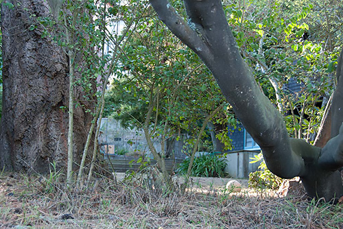
The Original Shot. A landscape orientation.
The scene charmed us but we'd already gone by it with our camera securely holstered so we didn't take the shot.

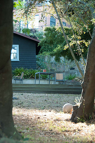
Second Shot. Portrait orientation.
Well, not that day.
But we did go back the next, with the same gear at the same time, and took the shot.
We remembered it differently than we saw it, though.
Somehow we had placed ourselves in the yard at ground level, the ball much bigger than it now appeared to us as we lifted the D200 to our eye. So we were not satisfied with our landscape capture that included everything, just to be safe.
But there was nothing about the setting that called out for a portrait orientation. Still, we had no other obvious option, so we turned the camera 90 degrees, changed out point of view a bit and framed a second shot.
We had stopped down to f10 to get most of the scene in focus. Maybe that was a mistake. Had we focused shallowly on the ball at f3.5, we might have liked the capture better.
Our focal length was a slightly telephoto 52mm (78mm in a 35mm equivalent), just for the record. The scene determined that, though.
THE CROP
Although we worked on the landscape version first and took it all the way to the end, we'll spare you those details. There was something off about it. It lacked drama. And somehow we saw this as a dramatic moment, the end of the play, the characters suffering their fates, the original object of desire forgotten on the stage. Left behind.
Landscape didn't give that to us.
But portrait orientation did. Framing the ball between the two dark tree trunks gave the scene curtains that narrowed the view to the background, middleground and foreground stepping out of the darkness and into the little sunlight left.
We made it as narrow as we could and we did one other thing. We corrected perspective.
We did that in two steps. First by applying the proper lens correction to the image and secondly by squaring up the building in the image. That left the steps slightly askew but steps are often askew, particularly when seen at an angle. And they were not enough askew to bother with something like the Upright tool or manual perspective correction.
COLOR
As the original color capture above shows, though, the painted buildings are distracting. That's color's job, after all. Ask any male bird. It draws the eye. And in this case the spotlight was on the white ball, the faded white ball.

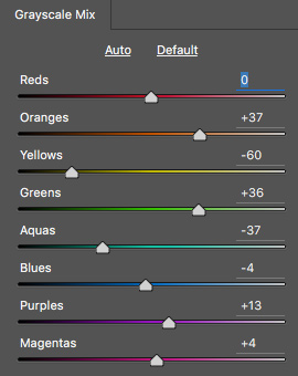
Color Range. Each hue's tonality adjusted independently saved the day.
So the color had to go.
That left a pretty muddy image. The dark tones simply ran into each other, obscuring whatever detail was in the shot.
But that's where adjusting tonality by color range comes into the picture.
The starting point on this set of eight hue sliders is the midpoint in each of them. The screen shot to the left shows the final settings, in which Red alone remains at zero.
You can see that we greatly darkened our Yellows and Aquas while greatly lightening our Oranges and Greens. The color names are a bit misleading, but we wanted to get some separation in the background without detracting from the spotlight on the ball.
GRADIENT MAP
We couldn't quite get the depth we wanted in our darker tones so we resorted to an old trick: a duotone. Or, as we call it these days, a gradient map.
We picked one that made sense. Not a green secondary color but a more sepia-toned one. That brought the dark scene to life without stealing the spotlight.
And we were done.

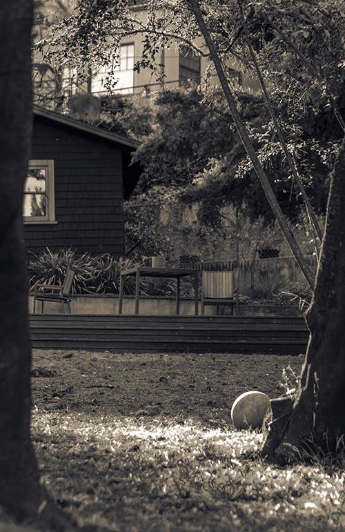
Game Over. Dramatic darks with the spotlight on the ball.
CONCLUSION
We spent about 260 words describing how we took the shot. But we spent about 410 words describing post production. Some people might argue that those 260 words are all one can say about the art of composition.
But they're leaving the party way too early. They're missing the cake and dancing.
The difference between the camera capture and the final image of Game Over shows how important post processing composition is to an image. Not to mention how much fun it can be.
Comments
Mike, another excellent post!
Funny thing is, revisiting it after dark with no ambient falling on my laptop, it now looks like a twilight shot with perhaps a motion detect light coming on to provide a spotlight for the ball.
-- James
Day for night, eh? Except for all that light reflected in those big windows in the background. Still with the right wine, one might be forgiven. -- Mike